The Art of Restraint on Specialty Paper Our luxury business cards are crafted from tactile, premium specialty papers. Because these uncoated stocks possess a profound natural beauty, we highly recommend using printing as an elegant accent rather than a full canvas.
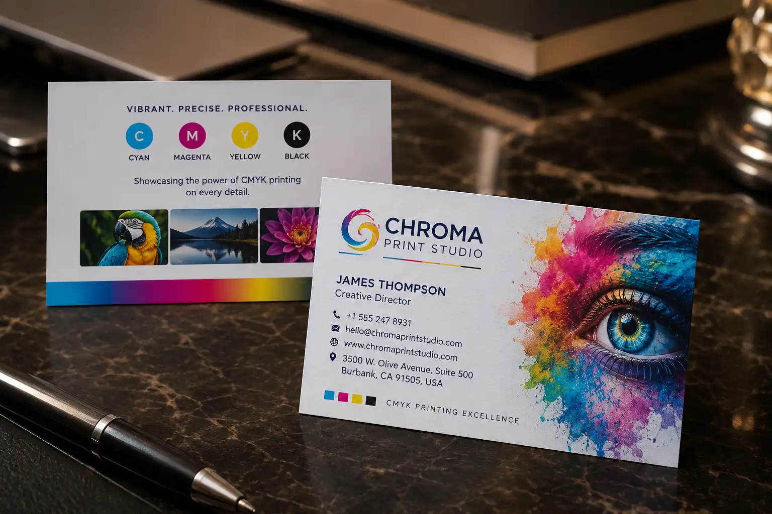
Understanding CMYK (Four-Color Process) CMYK stands for Cyan, Magenta, Yellow, and Key (Black). It is the standard offset printing method used to reproduce full-color photographic imagery and complex multi-color gradients. It works by layering tiny, semi-transparent dots of these four base inks to create a wide spectrum of colors. However, because specialty papers are highly absorbent, CMYK inks naturally sink into the fibers, which can result in slightly softer, muted tones compared to a digital screen.
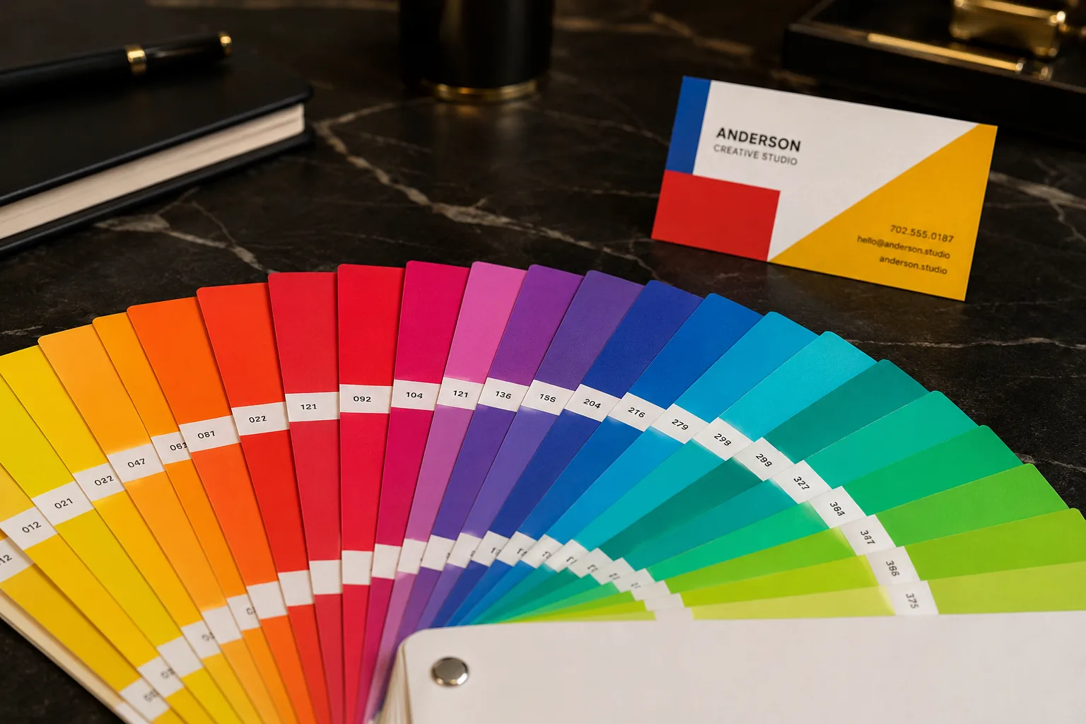
The Spot Color Advantage (Pantone/PMS) For absolute color purity and brand consistency, Spot Color is the industry gold standard. Unlike the dotted layers of CMYK, Spot Color uses a single, pre-mixed custom ink. This results in a flawlessly even, richly saturated, and tactile layer of color that CMYK simply cannot replicate on high-fiber paper. Unless your design strictly requires photographs, Spot Color is the definitive choice for brand logos and solid accents.