
Deboss vs Emboss
Pressed down or raised up
Deboss presses artwork into the paper. Emboss raises artwork above the surface. This comparison helps customers choose the right tactile direction.
Press your logo, monogram, border or pattern into premium paper for a tactile business card that feels refined before it looks loud. Choose blind deboss, raised emboss, sculpted emboss, black-on-black texture or deboss plus foil based on your artwork.
Deboss, emboss and sculpted emboss are not the same finish. The best result depends on paper thickness, logo shape, pressure area, line weight and whether you want ink, foil or a blind tactile mark.
Deboss presses artwork into the paper. Emboss raises artwork above the surface. This comparison helps customers choose the right tactile direction.
A repeated blind deboss pattern can turn the back side of a business card into a subtle tactile brand texture while keeping the front readable.
Sculpted emboss can raise a logo, badge or illustration in several shallow levels for stronger tactile relief.
Black-on-black deboss uses pressure and side-light shadows instead of bright ink or metallic decoration.
A restrained foil line or metallic text can be paired with debossed details when the design needs a quieter luxury direction.
Use these examples to decide whether your project needs a quiet blind logo, a raised badge, a textured paper direction, a dark-on-dark card, an earth-tone surface or a combination with foil.
Forest green cards with subtle tactile and metallic details for premium service brands.
Soft color papers can make debossed cards feel lighter and more contemporary.
Embossed illustrations can add a quiet raised detail for hotel, travel and lifestyle brands.
Textured papers add extra surface character, but deboss depth and line weight need review.
Minimal debossed cards rely on paper texture, spacing and subtle pressure instead of heavy decoration.
Small metallic accents can support debossed artwork without taking over the whole design.
Warm paper colors such as terracotta and taupe can make tactile details more approachable.
Earth-tone papers can make blind deboss feel softer and more lifestyle-oriented.
Textured pink paper can support a subtle debossed script logo for studio or floral brands.
Rounded corners and minimal raised marks can keep the card clean while adding a tactile detail.
Darker lighting, metallic accents and debossed artwork can be used for stronger luxury presentation.
A grey sculpted emboss sample can show raised relief in a more muted material direction.
Soft pink cards can use a very subtle deboss mark for a gentle minimal brand impression.
A repeating blind deboss texture can help explain how branded back-side patterns may work.
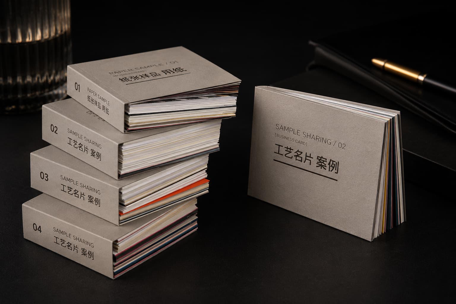
The ZIVFY sample book is a material and finish reference for paper feel, card thickness, matte surfaces, deboss-related samples, foil accents, gloss details and premium business card directions.
Send your quantity, paper direction, pressure process, artwork files and compatible finish requirements. We will review paper thickness, pressure area, line weight and production feasibility before pricing.
Pressure, paper, artwork size and finish combinations all affect the final tactile result. These answers help narrow the direction before production review.
Deboss presses the artwork down into the paper. Emboss raises the artwork above the paper surface. The better choice depends on paper thickness, logo shape, line weight and the tactile effect you want.
Blind deboss works best with logos, monograms, icons, simple borders, larger line artwork and controlled background patterns. Extremely tiny text, thin hairlines and dense artwork may need adjustment.
Yes. Deboss can be combined with gold foil, silver foil or other metallic accents when the paper and artwork can support both pressure and foil registration.
Yes, sculpted emboss can be reviewed for badges, crests, illustrations, animals, portraits, monograms and larger logos. It should remain shallow and paper-like, not a thick 3D plaque.
Thick cotton paper, textured paper, soft-touch matte paper, black paper and selected duplex structures usually work well. The exact paper needs review with the artwork and pressure area.
For most custom debossed or embossed business card projects, quote direction starts from 200 pcs. More complex finish combinations may be more efficient at higher quantities.
Yes. The sample book is a material and finish reference for paper feel, thickness, surfaces and premium finish directions. It is not a full proof of every possible custom deboss combination.
No. You can send logo files, text, sketches, reference images or print-ready files. We can review deboss area, paper direction, finish combination and production feasibility before quoting.