
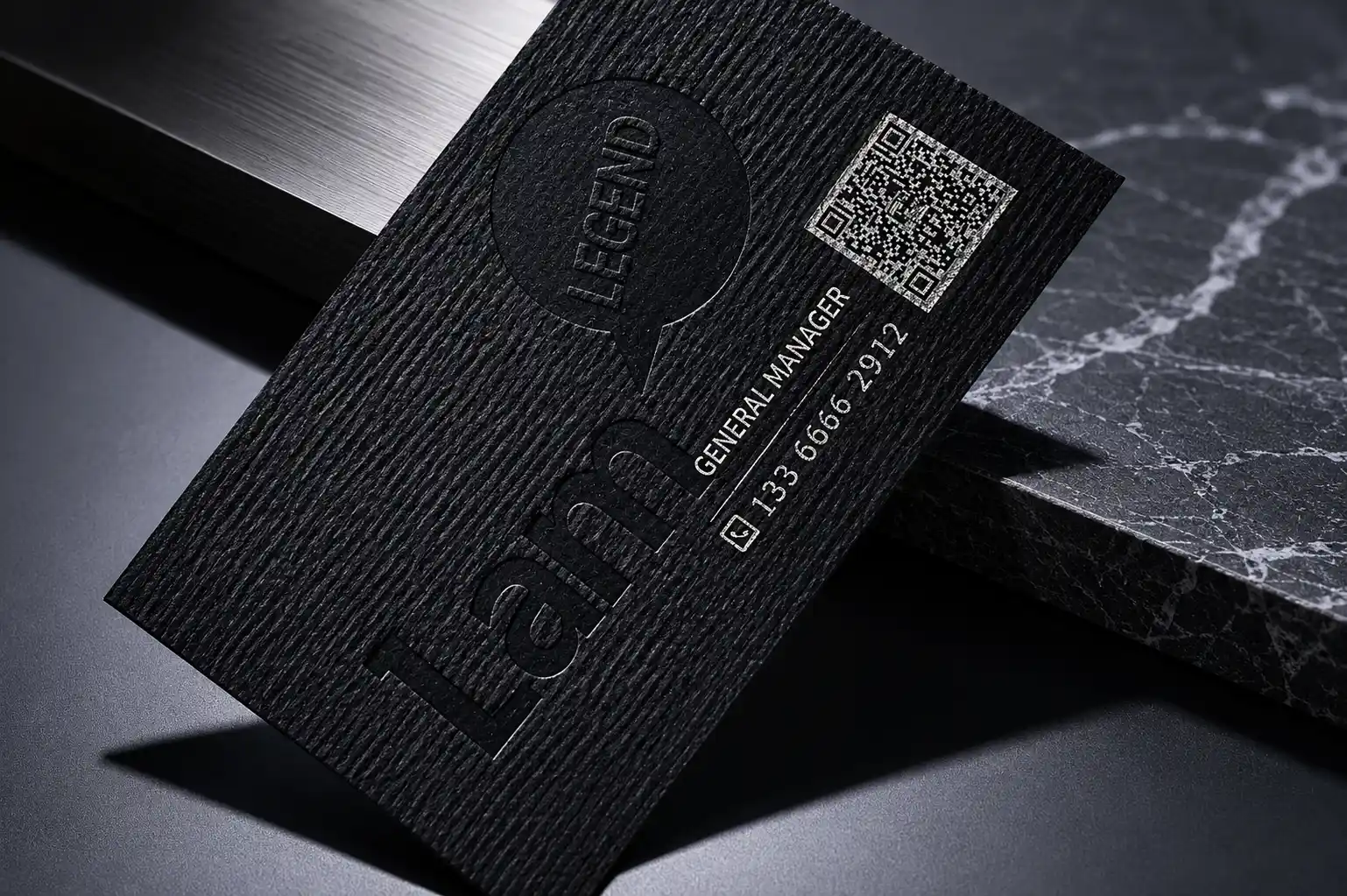
Fine Horizontal Ribbed Texture
Black horizontal ribbed texture
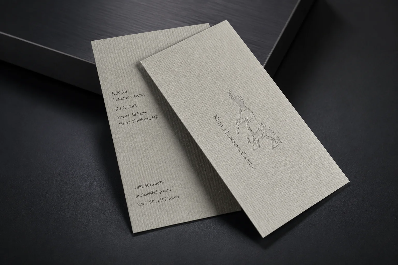
The dark finished card uses a fine one-direction ribbed paper surface, not a crosshatch linen texture.
Create custom textured paper business cards with crosshatch linen, fine horizontal ribbed, laid, fine grain or eggshell surfaces. Stock colors can be selected by sample review, and full coverage Pantone / spot color printing can be reviewed when your brand needs a specific color on textured paper.
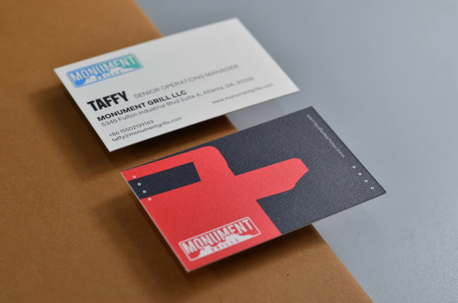
Linen business cards have a crosshatch pattern with lines running in two directions. Ribbed and laid papers have parallel lines; fine grain and eggshell surfaces have a less directional texture. We can make cards in each of these directions. The first three photos below show the same horizontal ribbed surface in different colors. For crosshatch linen, specify that texture when requesting your quote.
The dark finished card uses a fine one-direction ribbed paper surface, not a crosshatch linen texture.
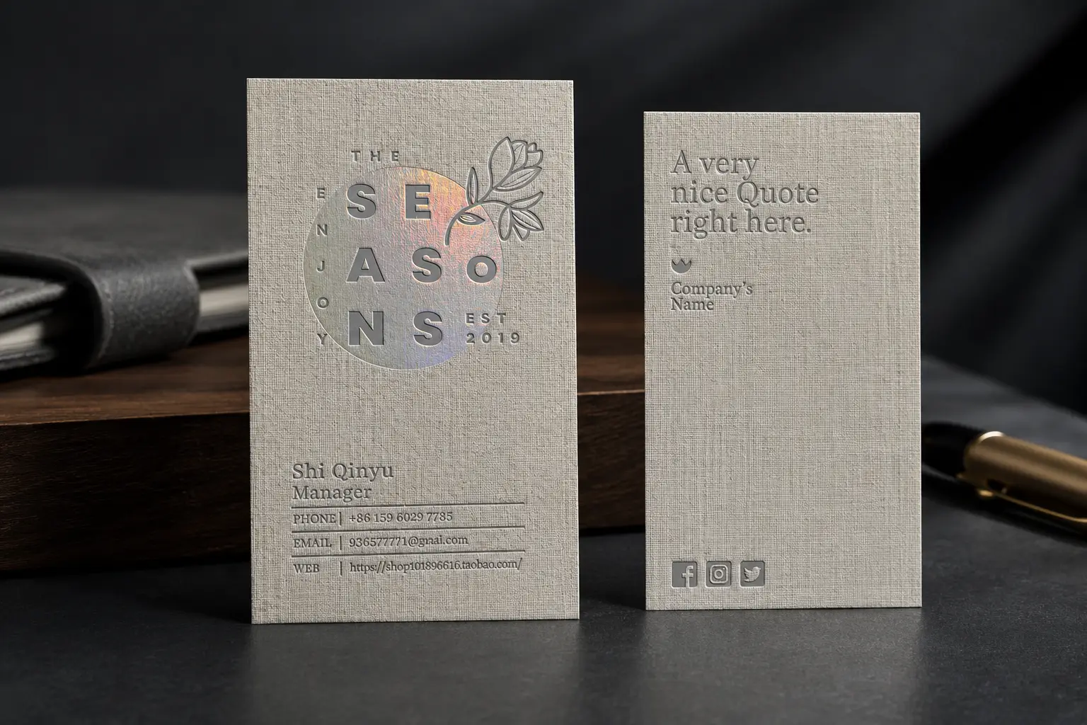
The light finished card uses the same fine horizontal ribbed surface direction, suitable for clean typography and subtle logo work.
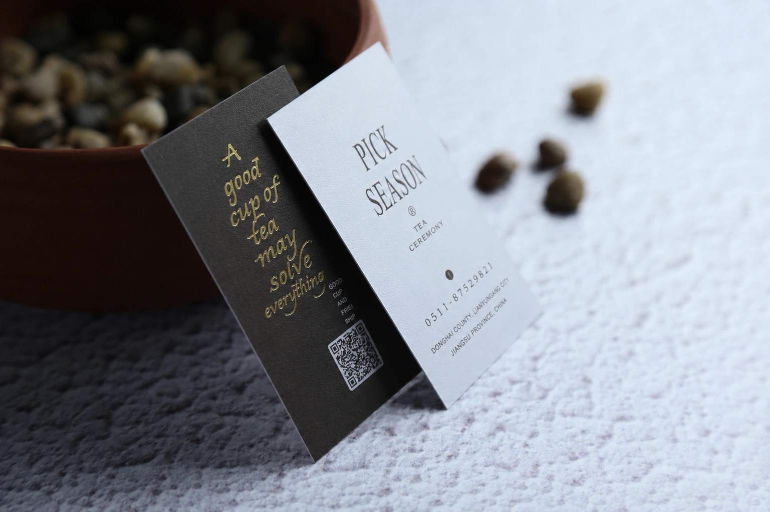
Different stock colors can use the same horizontal ribbed paper texture for a consistent tactile card system.
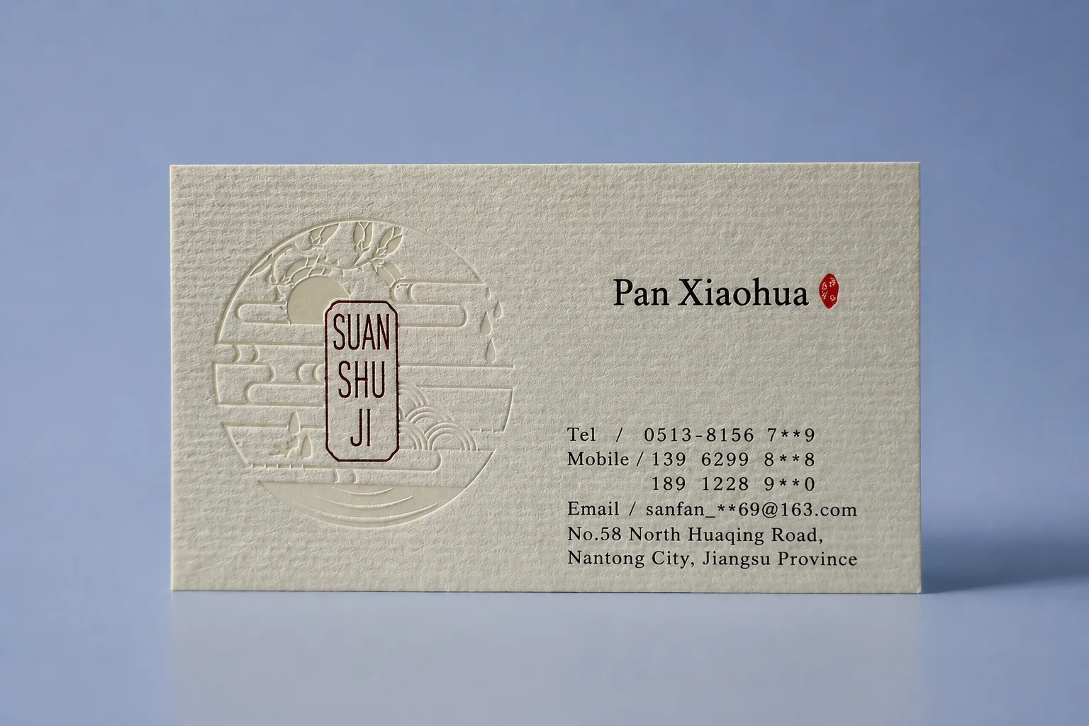
Parallel line texture for stationery-style cards, professional services, and restrained identity systems.
A subtle grain without a strong line pattern. If your layout includes small text, a QR code or a detailed image, send it for artwork review before confirming the stock.
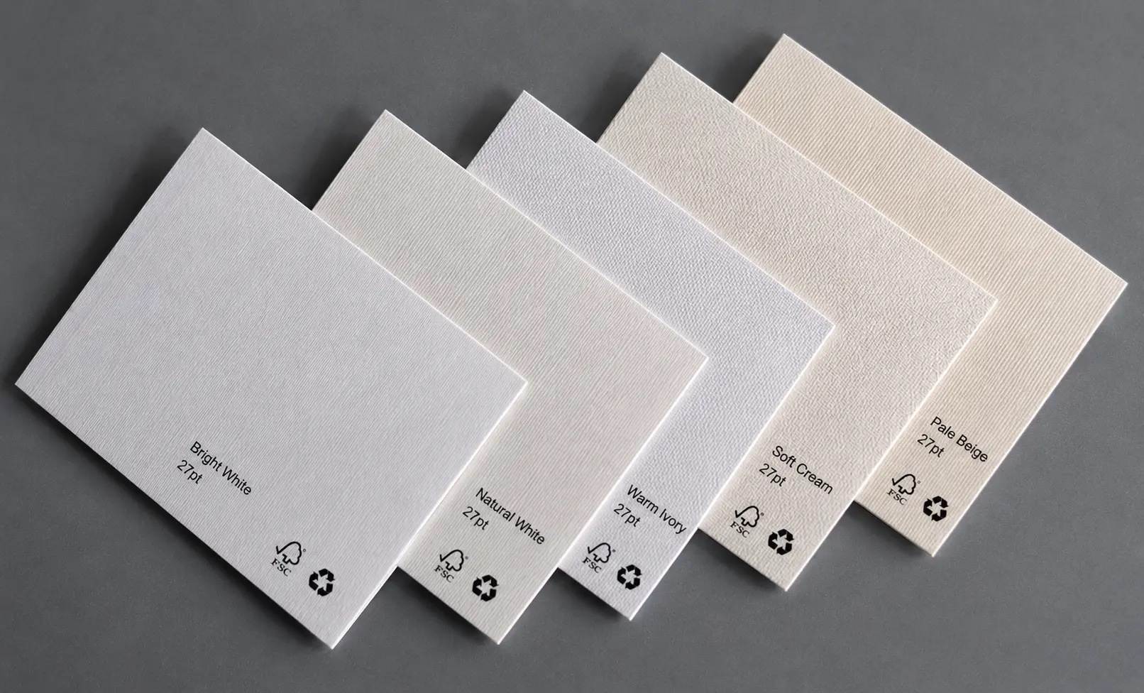
Use the swatch set to compare different texture patterns, stock colors, and thickness references before confirming the paper direction.
GSM describes paper weight, while the measured thickness and pt reference make the hand feel easier to understand. These ranges are grouped from the available textured paper directions for quoting and sample review.
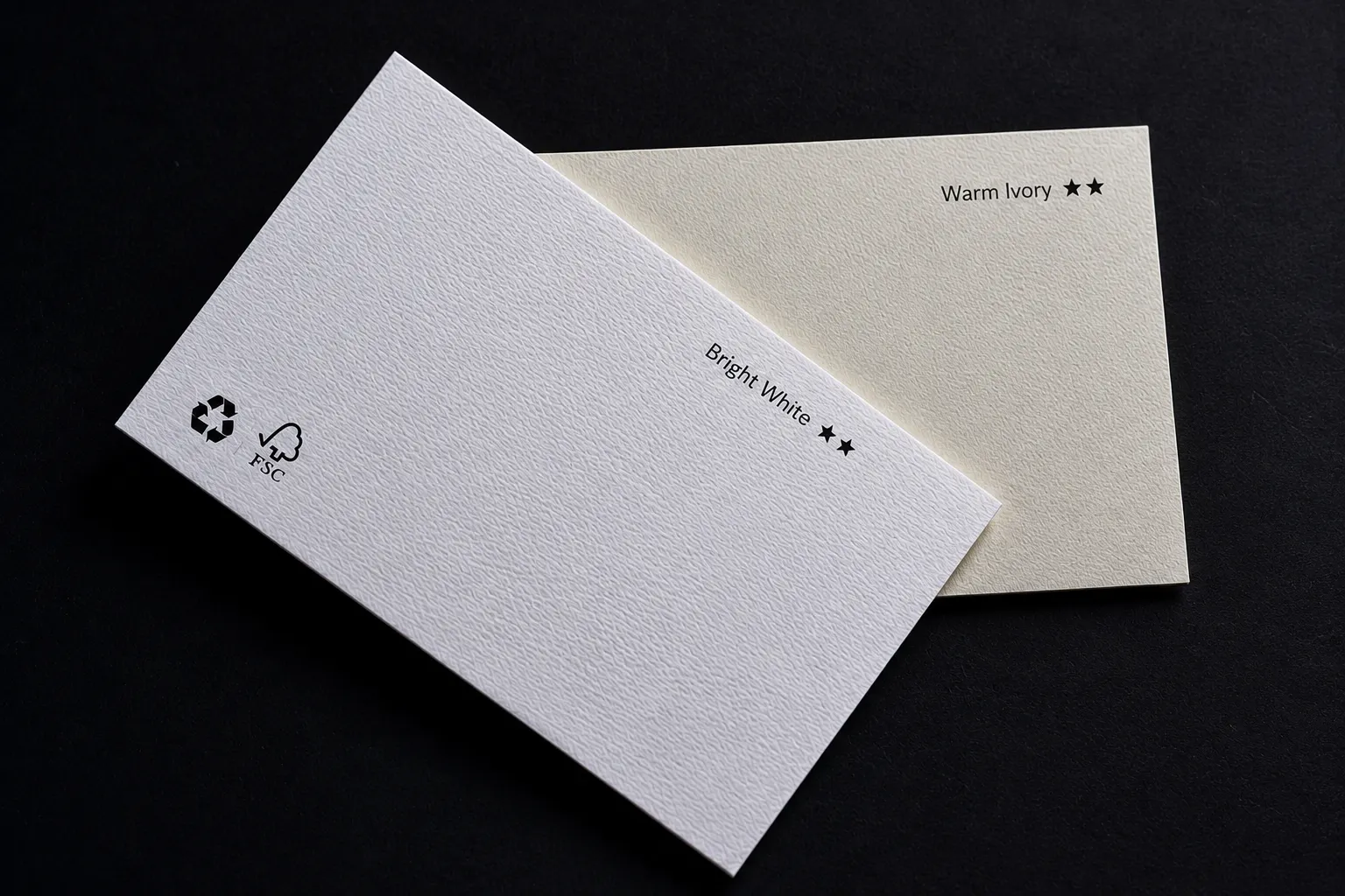
A lighter textured paper direction for clean business cards, natural stationery, and simple brand layouts.
A heavier textured direction around 25–27pt, useful when the card needs stronger body while keeping visible paper texture.
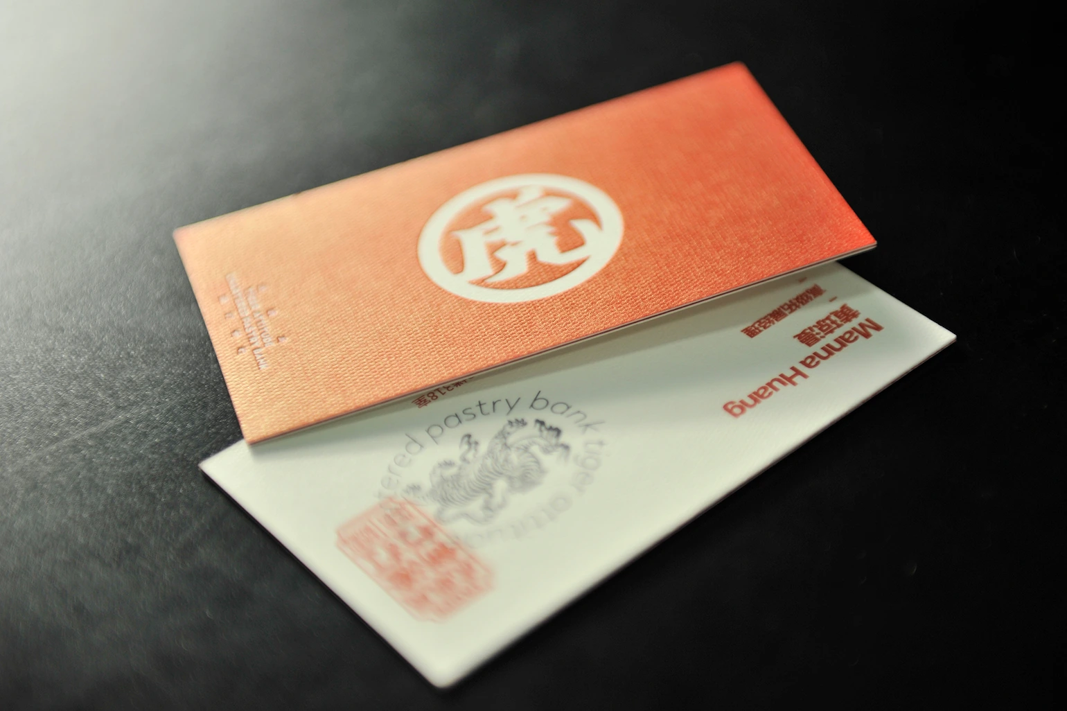
An extra thick textured direction around 29–31pt for stronger presentation, large logo areas, and more rigid premium cards.
Textured paper can use existing stock colors, or the surface can be printed with a full coverage Pantone / spot color when a brand needs a controlled color. The printed color still sits on top of the tactile paper surface, so texture remains part of the final look.
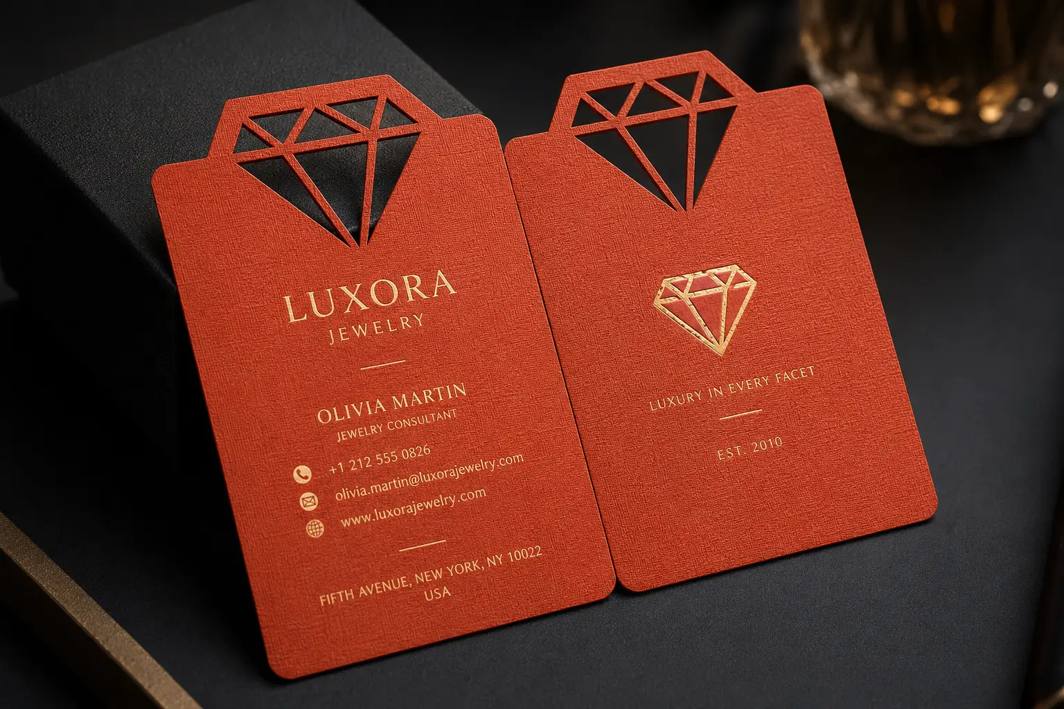
Clean textured white direction for modern identity cards and high-contrast artwork.
Warmer paper tones for stationery-style branding and softer premium cards.
Natural textured paper colors for boutique, hospitality, craft, and lifestyle brands.
Neutral grey textured surfaces for understated professional business cards.
Dark textured paper options for blind deboss, foil contrast, or dramatic minimal designs.
Brand colors can be reviewed as full-surface spot color printing on selected textured papers, not only fixed stock colors.
Foil, blind debossing, embossing, full coverage spot color and die cutting can be reviewed with your chosen paper. The images below are paper and layout references; confirm the requested finish against the selected stock and artwork.
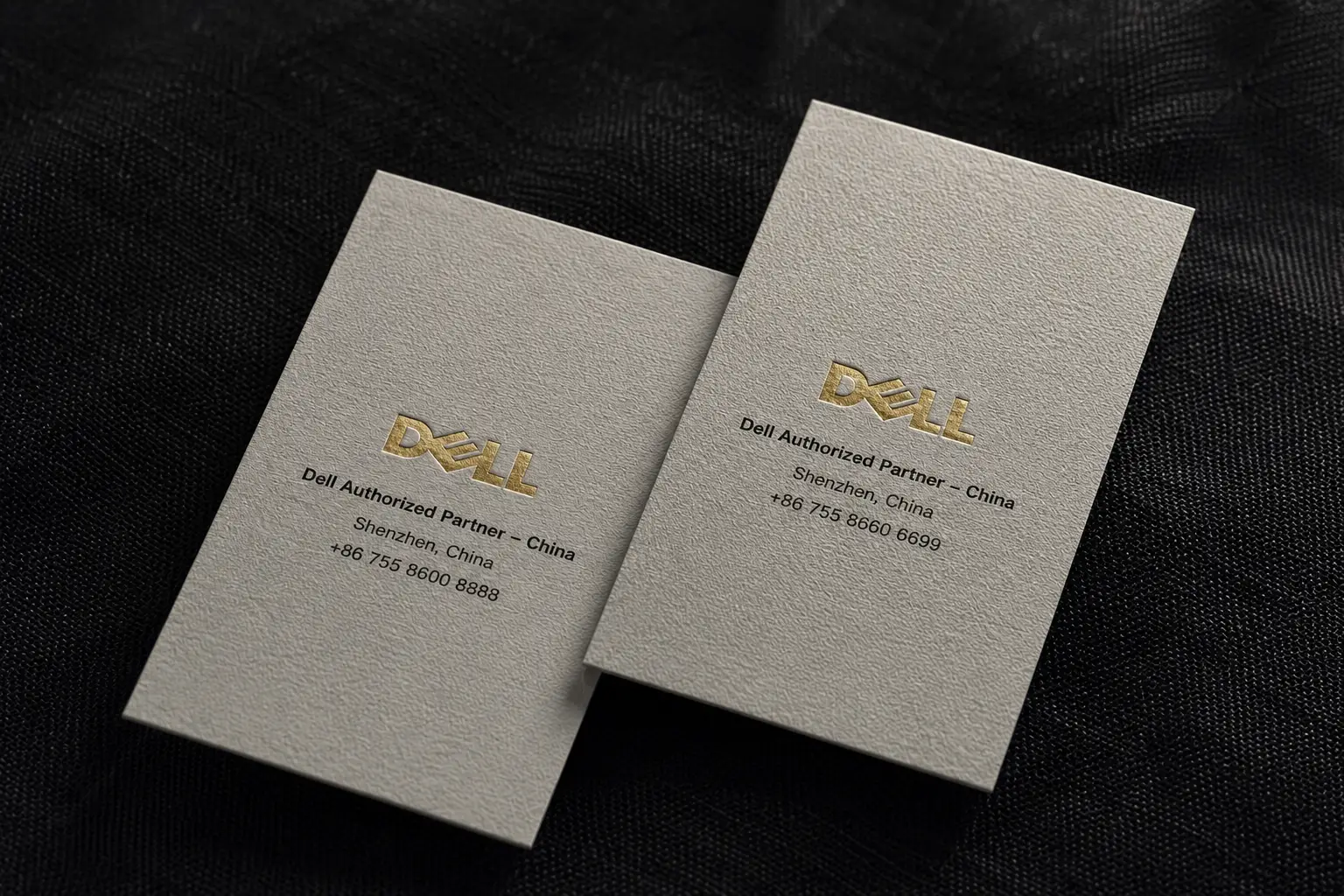
Foil area and line detail need to suit the paper surface. Review fine lines and small lettering before production. See our foil artwork and paper guide.
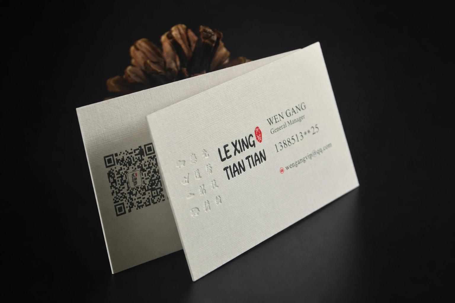
Pressure can make a pressed area look smoother than the surrounding grain. Review the contrast you want with the selected stock. See our embossing and debossing guide.
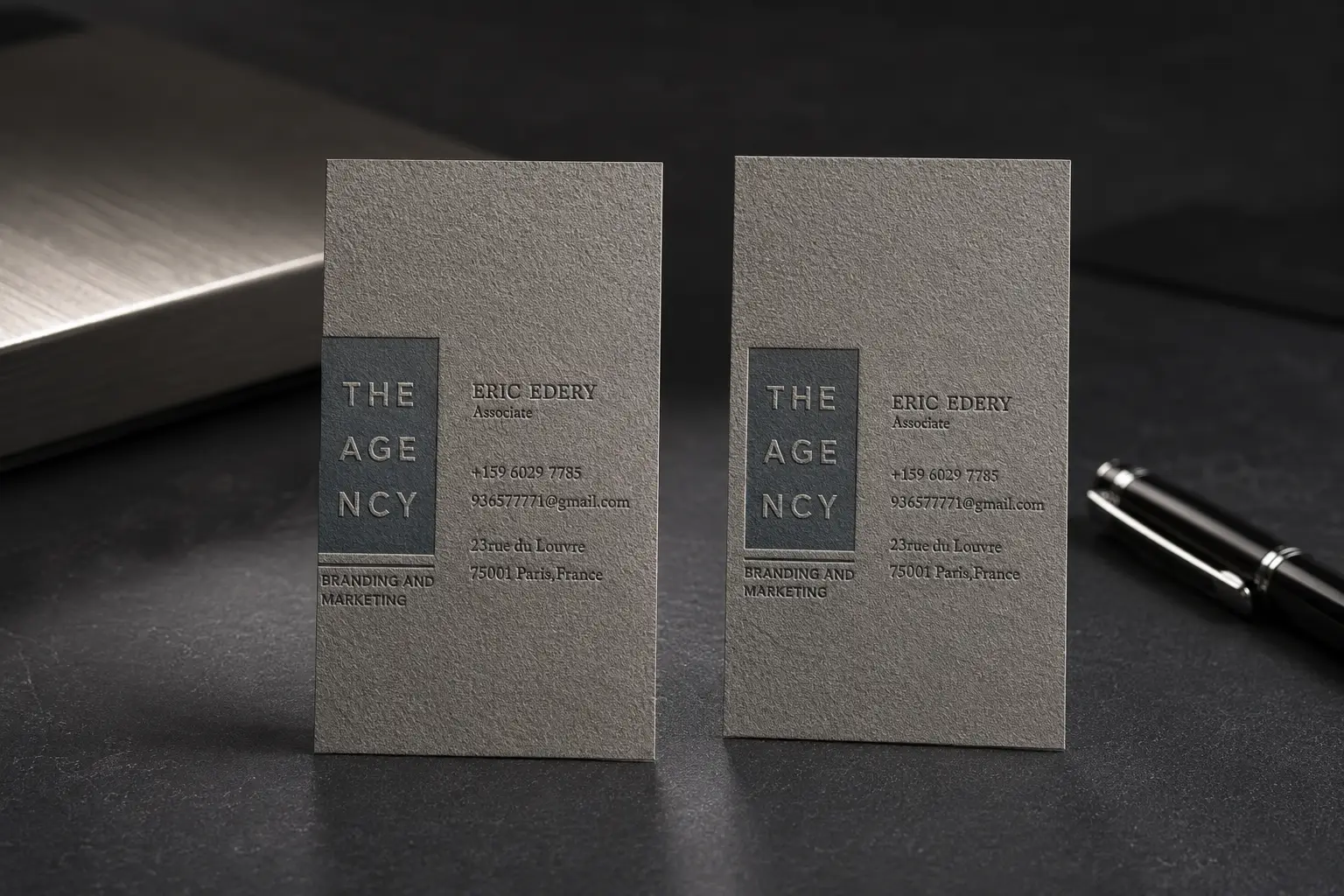
Embossing or letterpress-style pressure can be reviewed for logos, initials, and larger artwork areas.
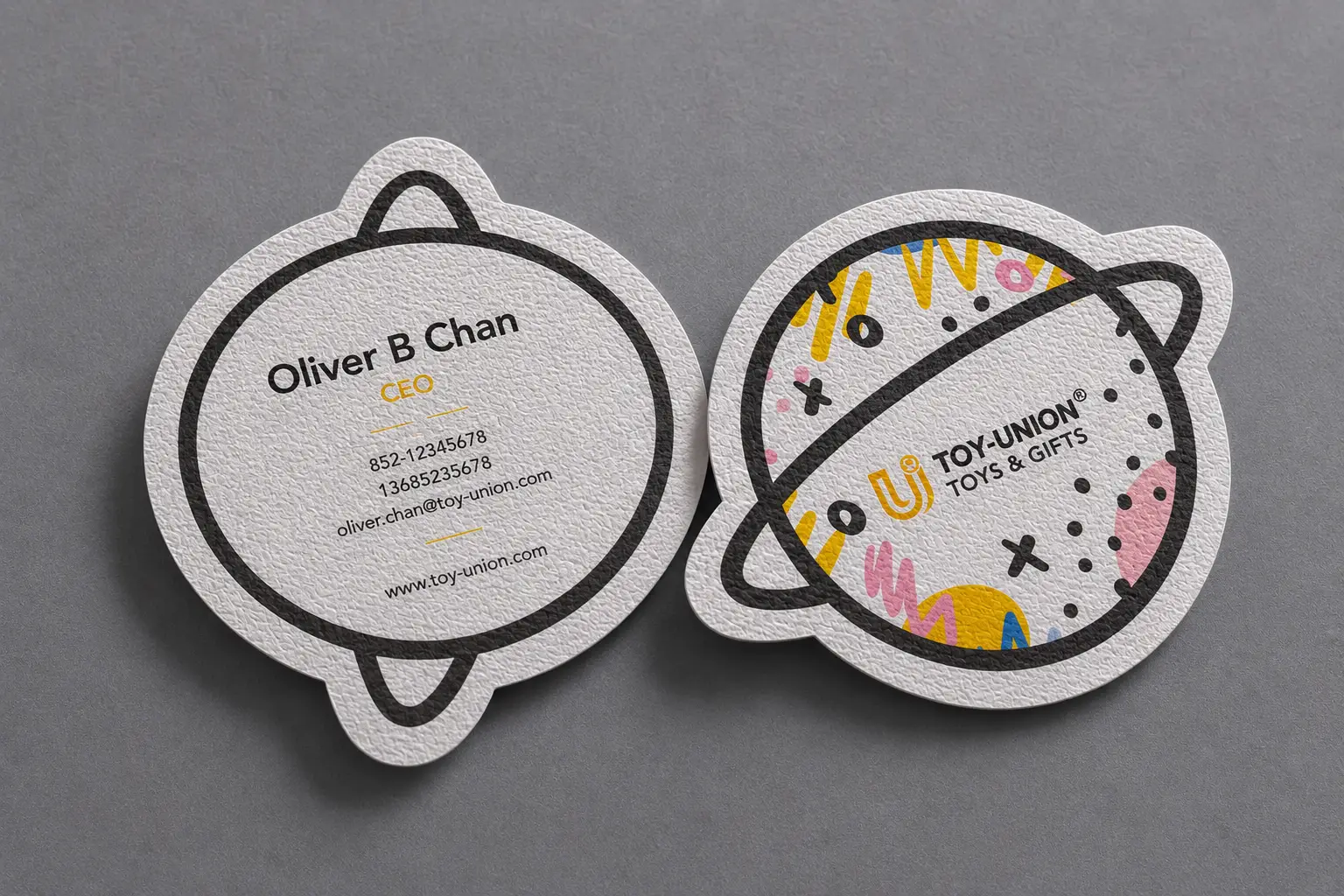
Shape changes and rounded corners can make textured paper feel more finished without overloading the artwork.
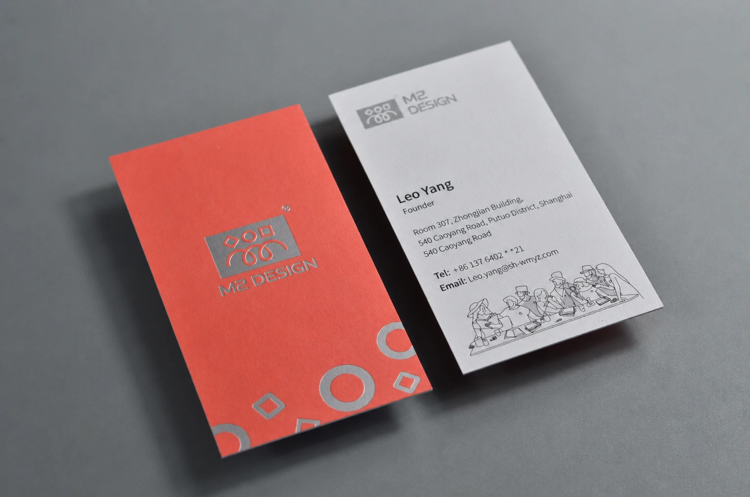
Review full coverage Pantone or spot color on the chosen texture, especially when a large area must match your brand color. Our full coverage spot color guide explains what to prepare.
Textured paper is difficult to judge from screen images alone. The ZIVFY sample book is a material and finish reference for comparing paper grain, stock color, measured thickness, foil, debossing, and surface direction before confirming a custom quote.
The sample book is not a one-off custom proof. It helps you compare physical materials and decide whether your project should use existing textured stock, full coverage Pantone / spot color printing, or a different paper surface.
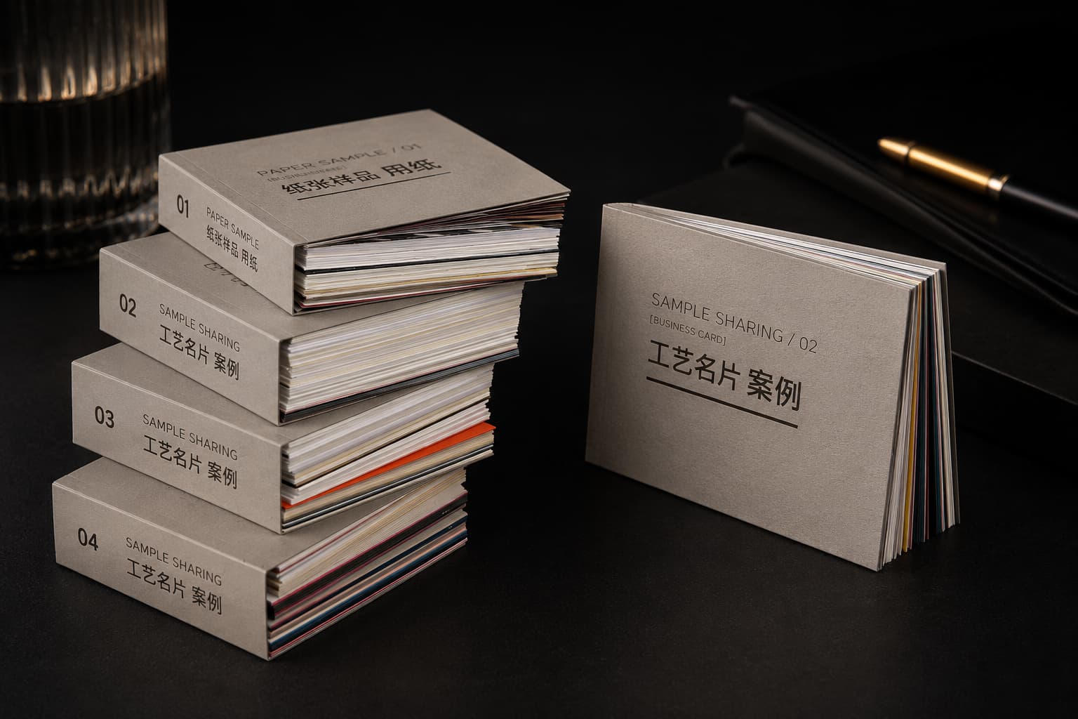
Share your quantity, paper surface, thickness, color, finish and artwork. Minimum order starts from 200 pcs per design. For crosshatch linen, select Other Texture / Sample Review and write linen in Additional Requirements / Questions.
Textured paper has a visible or tactile surface such as fine woven, laid, eggshell grain, or fine woven grain. The paper surface becomes part of the card design, not just a background material.
Yes, foil stamping can be used on selected textured papers. Very fine foil lines, small text, and detailed artwork should be reviewed against the chosen paper surface before production.
Yes. Blind deboss, foil deboss, and pressure-based details can work well on textured papers, especially when the artwork area is not too small and the texture is matched to the design.
Standard textured cards are suitable for simple business cards, premium directions provide stronger hand feel, and thick textured cards create a more rigid premium presentation. Physical samples are recommended for final choice.
Textured paper is usually better for logos, typography, line art, foil, debossing, and restrained graphics. Photo-heavy or high-detail full-color designs may need a smoother paper surface for sharper reproduction.
Yes. If your brand has a specific color, we can review full coverage Pantone or spot color printing on selected textured papers. This helps create a controlled brand color while keeping the visible tactile paper surface.