
Spot Color Printing & Flood Print Guide
Learn how premium business card printing works when brand color accuracy matters. For high-end custom cards, ZIVFY usually recommends spot color printing for logos, typography, and solid brand colors. CMYK is available when the design requires photographs, gradients, or complex full-color artwork.
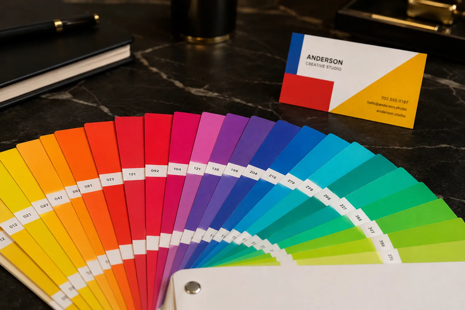
Spot color uses a pre-mixed solid ink direction for cleaner brand color, stronger saturation, and more controlled results on premium specialty papers.
For luxury custom cards, spot color is usually the better starting point.
Premium specialty papers often absorb ink differently from coated commercial stocks. Spot color printing uses a pre-mixed solid ink, making it more suitable for brand logos, solid text, icon systems, and controlled color accents.
Spot color printing
Best for brand colors, solid logos, typography, and clean premium layouts. It gives a more even and saturated color impression than process color on many specialty papers.
CMYK printing
Useful when the design includes photographs, gradients, illustrations, or complex multi-color imagery. It is not the default choice for most luxury solid-color card designs.
Flood print
Applies a solid background color across the card face. It creates full surface coverage, but it does not change the card’s edge color or internal paper color.
Printing and flood print examples on specialty stocks
Flood print and spot color can create strong brand surfaces, but the final look depends on paper texture, ink absorption, background coverage, and whether other finishes such as foil, UV, or debossing are added.
Spot Color Reference
Best for solid brand colors, logos, and clean color-controlled print areas.
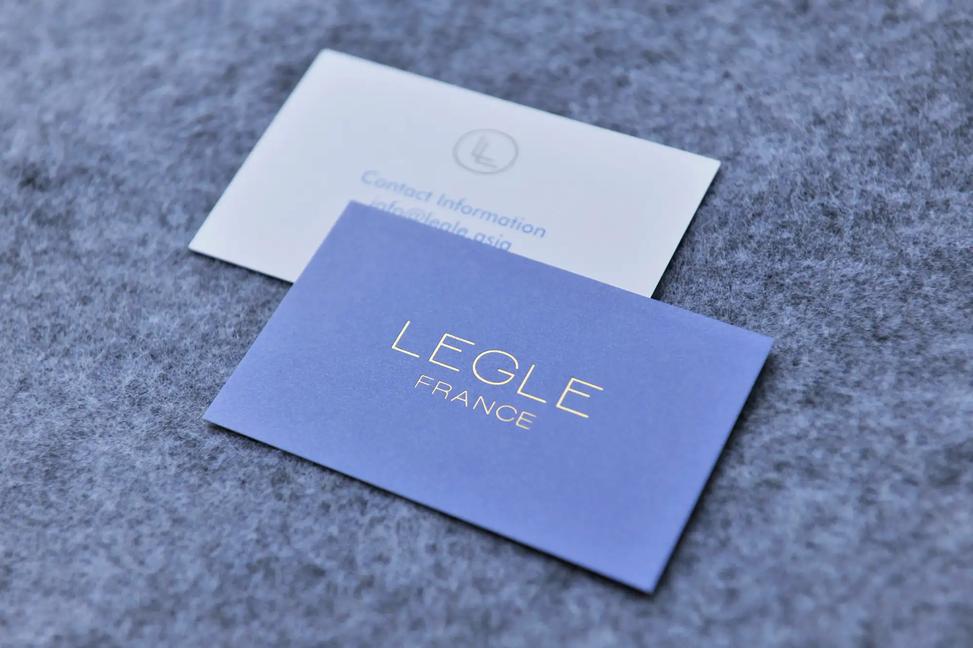
Vivid Solid Color
Strong spot color direction for bold brand identity systems.
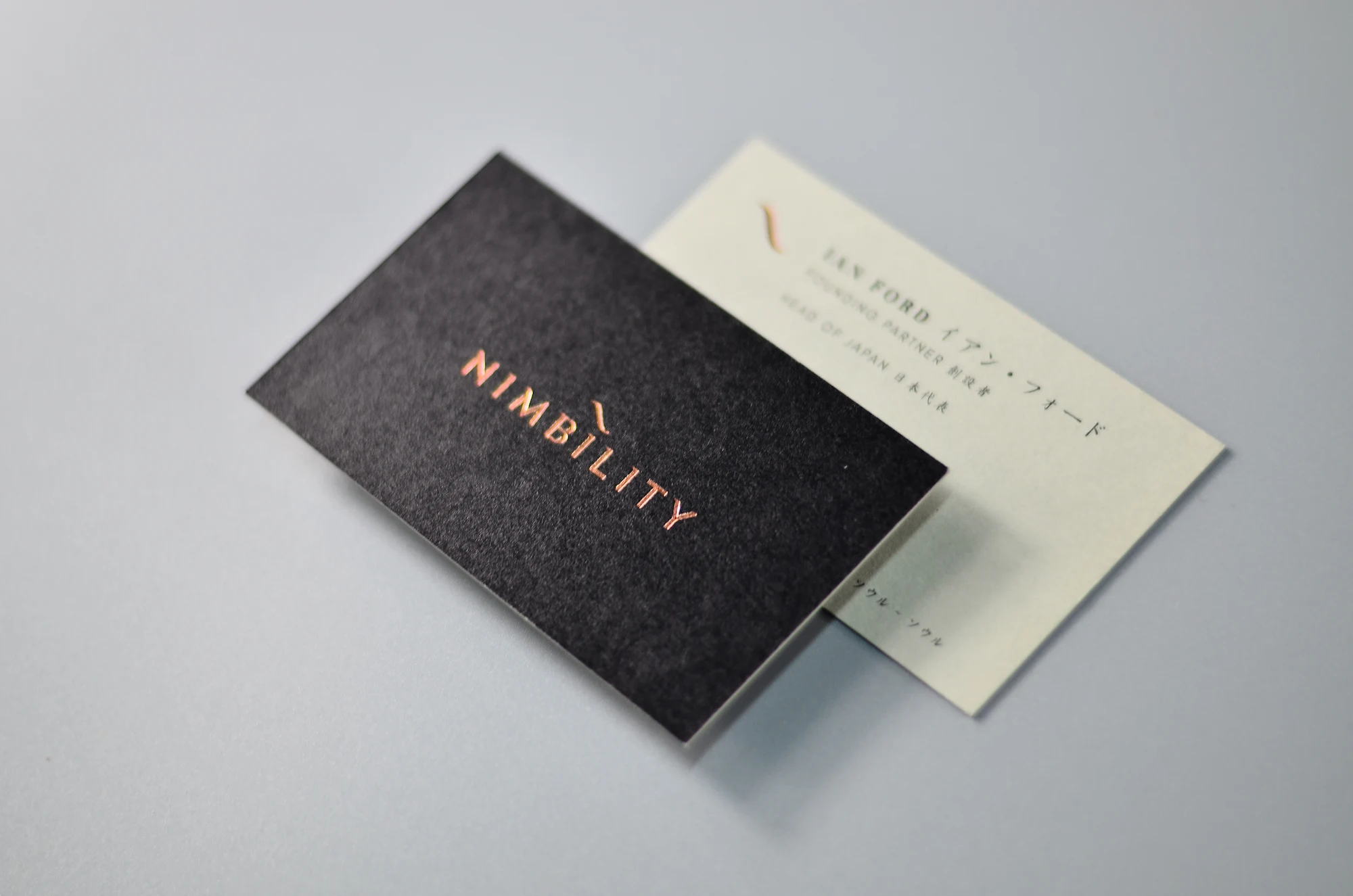
Specialty Stock Printing
Ink behavior changes with recycled, textured, and specialty paper surfaces.
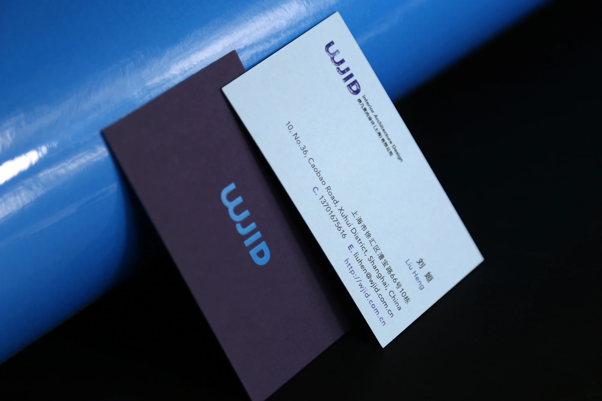
Two-Tone Flood Print
Full surface color can support stronger front-and-back contrast.
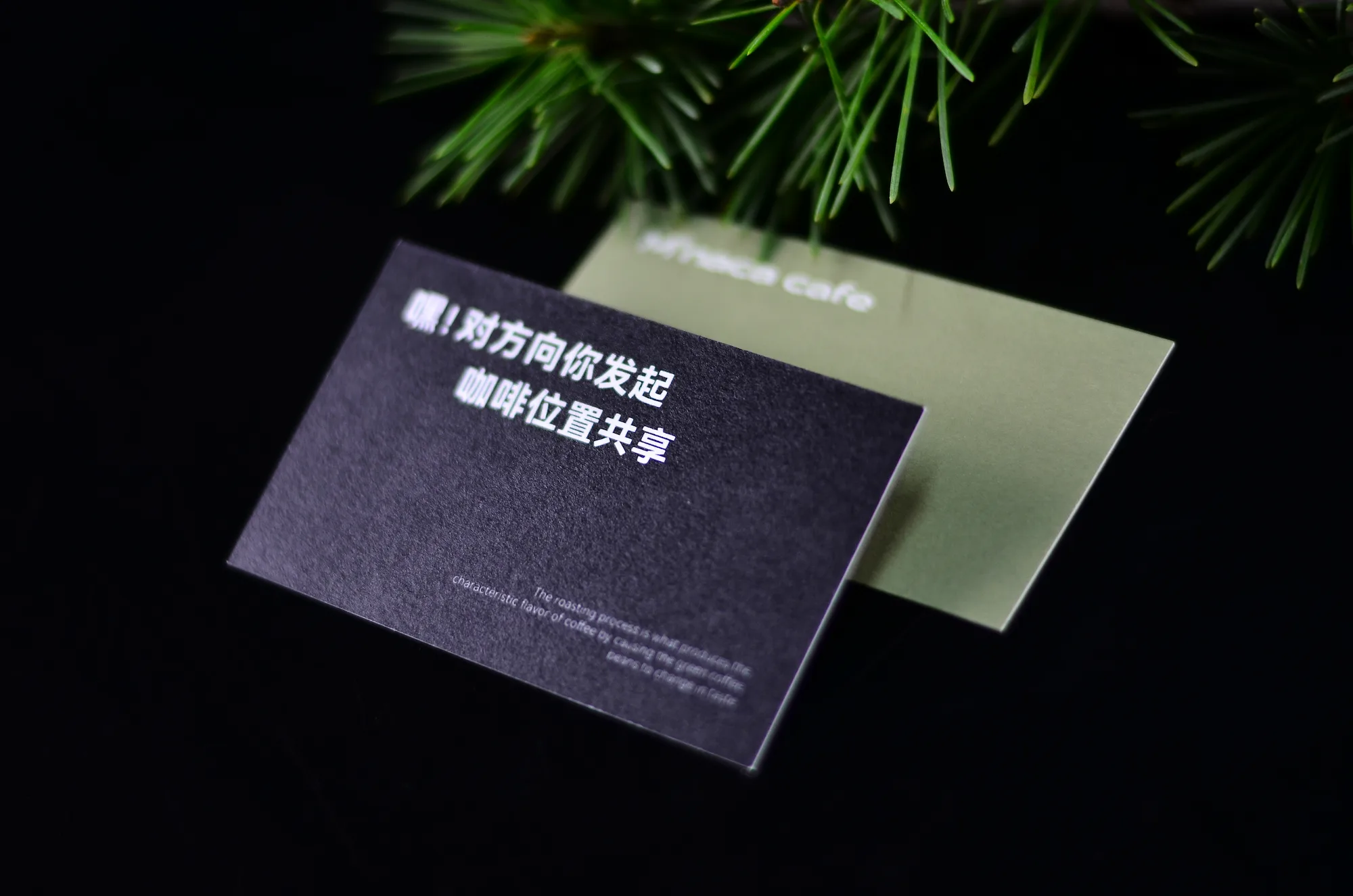
Bold Tinted Surface
Flood print can create a strong colored face while keeping a tactile paper feel.
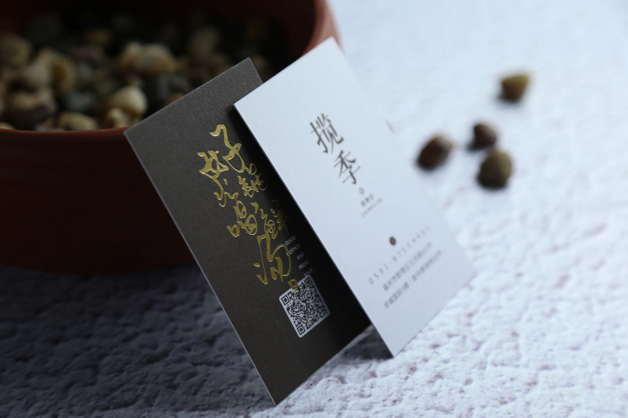
Saturated Ink Coverage
Heavy ink coverage requires checking paper texture, drying, and final surface feel.
Spot color, CMYK, and flood print comparison
Use this comparison to decide whether your card should use spot color, CMYK, flood print, or a combination.
| Feature | Spot Color | CMYK / Flood Print |
|---|---|---|
| Main purpose | Accurate solid brand colors, logos, typography, icons, and clean premium accents. | CMYK is for photos and gradients. Flood print is for solid full-surface background coverage. |
| Best use | Luxury cards, brand identity systems, corporate color matching, high-end simple layouts. | Colorful artwork, image-heavy designs, full background color, or complex multi-color artwork. |
| Color behavior | Pre-mixed ink direction with more even solid color on many specialty papers. | CMYK builds color from process dots; flood print covers the card face with solid background ink. |
| Premium recommendation | Usually recommended for high-end custom business cards unless the artwork requires process color. | Available, but not the default choice for most luxury solid brand color cards. |
| Edge color | Does not change the paper edge unless combined with edge painting. | Flood print covers the surface only; the cross-section edge usually remains the original paper color. |
How to choose the right printing direction
For premium cards, printing should support the material and finishing rather than overwhelm it. Spot color is usually the best match for controlled luxury branding.
Better for spot color
Choose spot color when your design depends on clean solid color and brand consistency.
Use CMYK only when needed
CMYK is available, but it should be selected for artwork that genuinely needs process color.
File setup for spot color and flood print
Proper file setup helps confirm whether the artwork should use spot color, CMYK, flood print, foil, UV, or another finishing layer.
Mark brand colors clearly
Provide the target Pantone, brand color reference, or physical sample if color matching is important.
Use full bleed setup
Flood print needs bleed so the color can extend past the trim edge and avoid white borders after cutting.
Keep finish layers separate
If the card includes foil, UV, debossing, embossing, or die cutting, keep those layers clearly separated from print artwork.
Combine premium printing with the right finish
Spot color and flood print can be combined with foil, debossing, UV, soft touch, thick card structures, and painted edges depending on the final brand direction.
Common questions about spot color and flood print
Is spot color better than CMYK for premium business cards?
Can ZIVFY still print CMYK business cards?
What is flood print?
Does flood print make the card edge the same color?
What file setup is needed for flood print?
Can spot color be combined with foil, UV, or debossing?
Need help choosing spot color, CMYK, or flood print?
Send your artwork, target brand colors, quantity, paper direction, and finishing requirements. We can review whether spot color, CMYK, flood print, or a combined setup is more suitable before quoting.