
Cream Pearl + Gold Detail
Cream pearlescent paper with subtle gold detail for elegant brand cards.
Pearlescent paper adds a soft light-catching shimmer to business cards without making the card look like plastic or metal. It works well for elegant brand cards, beauty, jewelry, hospitality, wedding and boutique projects.
These images show pearlescent paper in cream, silver, blue, rounded corner and minimal printed layouts. The page does not need many images because the thickness and stock information is already covered in the specification sections.
Cream pearlescent paper with subtle gold detail for elegant brand cards.
Ivory pearlescent paper with a soft gold logo direction for refined brand identity cards.
White pearlescent double-sided card direction with small gold logo details and clean business information.
Silver pearlescent stock for minimal layouts, blue printed details and clean contact information.
White pearlescent card with blue printed artwork for hospitality, beauty or boutique brand projects.
Cream pearlescent stock with minimal print and QR code for refined business card use.
Rounded corner pearlescent card with soft color artwork and a lighter visual style.
Pearlescent papers can have different measured thickness even when the paper weight looks similar. Use mm and pt together when reviewing card body, firmness and finish pressure.
A lighter pearlescent card direction for elegant single or double-sided printed business cards.
A firmer pearlescent paper direction for stronger hand feel and premium brand presentation.
A heavier pearl card direction for projects that need more body, stiffness and a more substantial feel.
Pearlescent paper is selected for a softer shimmer. Lighter artwork usually shows the pearl surface more naturally, while heavy dark ink coverage, very small foil details and high-gloss finishes should be reviewed before production.
Light changes the visible shimmer, so physical samples are useful before final confirmation.
Minimal layouts, soft colors, jewelry, beauty and wedding brands usually work well.
Ink coverage and paper color are reviewed together because the paper surface can affect final tone.
Foil stamping, debossing, embossing and selected die cutting can be reviewed by artwork.
Pearl shimmer changes with viewing angle, lighting and paper color. The ZIVFY sample book is a material and finish reference for comparing pearl paper colors, thickness, foil, debossing, ink coverage and finish direction before confirming a custom quote.
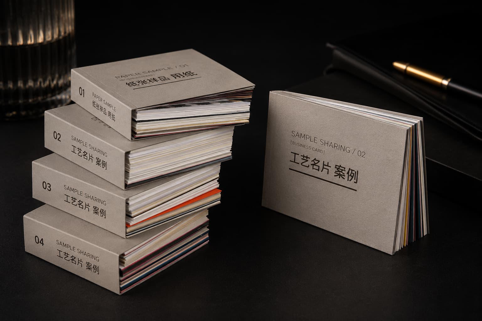
Send quantity, paper color direction, thickness direction, artwork sides, finish requirements and files. Minimum order starts from 200 pcs per design.
A compact FAQ keeps the page clean while still answering the questions buyers usually ask before sending artwork.
No. Pearlescent paper has a softer pearl-like shimmer, while metallic paper usually has a stronger reflective effect.
Light backgrounds, refined logos, beauty, jewelry, wedding, fashion and hospitality layouts usually work well. Heavy ink coverage should be reviewed.
Yes. Foil stamping can be reviewed for logos, names, borders and selected detail areas. Small foil details should be checked with the chosen paper.
Yes. Pearl paper color and shimmer direction should be confirmed from physical samples when color and reflection matter.
No. Pricing depends on quantity, paper color, thickness, artwork sides, finishes and shipping details.
Yes. The sample book is a material and finish reference, not a one-off custom production proof.