
At ZIVFY, the soft-touch finish comes from a smooth, matte lamination with a velvet-like hand feel. Compared with a gloss finish, the surface looks less reflective and feels less slick.
Soft touch is one of those finishes that looks simple in photos but feels very different in hand. That is also where buyers get stuck.
On screen, a soft touch card may look like a clean matte card. In real use, the laminated surface has a softer, more velvet-like feel than a typical matte finish. That feel can make a card seem more considered, especially when the design is quiet and the material has enough weight.
The problem is that feel does not show well in a mockup. A black card may look excellent in a photo and still show fingerprints more than expected. A light card may feel right but be harder to write on than an uncoated stock. A foil detail may look sharp, or it may pull too much attention away from the surface.
That is why soft touch should be treated as a material decision, not only a design style.
For commercial options, see ZIVFY’s soft touch business cards page. If you are still comparing paper, thickness, texture or finish direction, start with the business card sample book.
Quick answer: what soft touch finish means
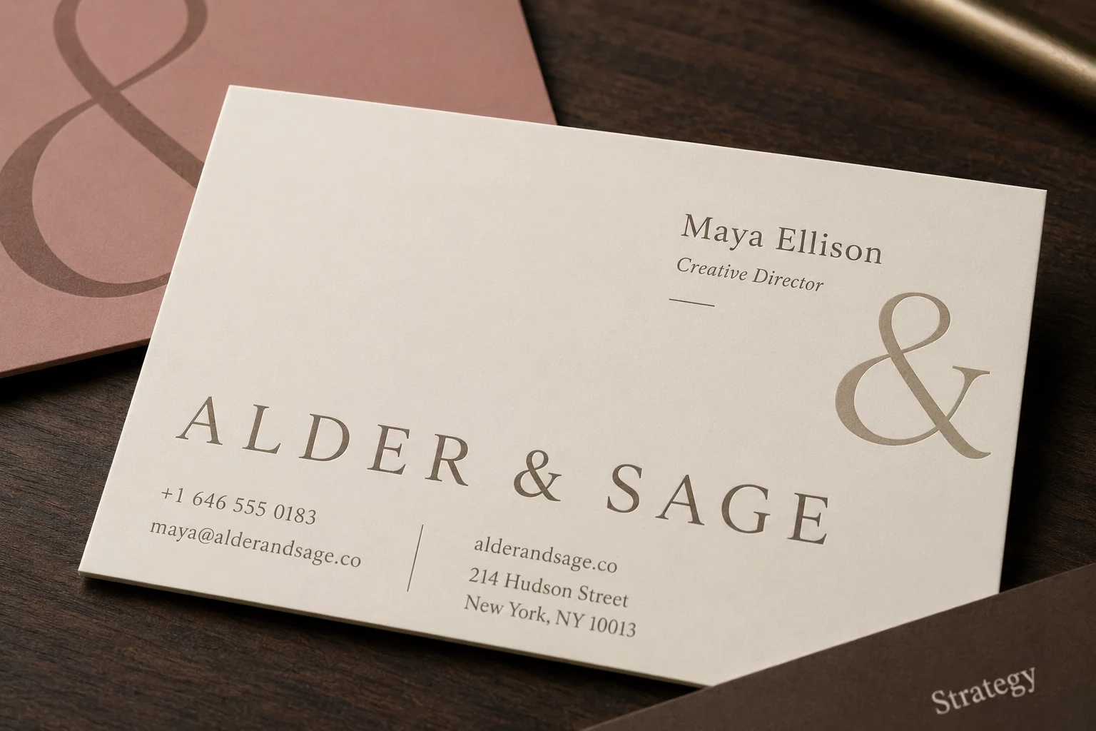
It usually affects three things:
- The card feels softer and smoother.
- The printed surface looks low-glare.
- Handling behavior changes, especially on dark colors.
The finish does not work alone. The final result depends on the base paper, thickness, ink coverage, color, and any extra finish such as foil, spot UV, debossing or embossing.
A thin soft touch card will not feel like a thick soft touch card. A dark soft touch card will not behave like a light one. A soft touch surface with heavy foil will feel different from a mostly plain card with blind debossing.
Those details matter more than the finish name.
Soft touch vs matte, uncoated, gloss and velvet
Buyers often use “matte,” “soft touch,” “velvet” and “suede” as if they mean the same thing. They are related, but they are not always identical.
| Finish direction | What it usually feels like | What it looks like | Best use | Watch out for |
|---|---|---|---|---|
| Soft touch | Smooth, velvety, tactile | Low-glare and refined | Premium brand cards, dark cards, minimal layouts, cards where hand feel matters | Fingerprints, scuffs, writing behavior and color shift should be checked with samples |
| Regular matte | Smooth, but usually less velvety | Low to moderate glare | Clean professional cards where touch is not the main issue | May feel more standard than expected |
| Uncoated paper | Paper-like and more natural | Less coated, often softer visually | Cards that need writing, stamping, letterpress feel or natural paper character | Ink may absorb differently and fine details may look less crisp |
| Gloss or spot gloss | Slicker and more reflective | Strong shine and higher contrast | Photos, strong color pop, selective highlight effects | Can create glare and feel less subtle |
| Velvet or suede naming | Usually describes a very soft matte feel | Similar visual direction to soft touch | Buyers who want a plush tactile surface | Naming varies by supplier, so samples matter |
ZIVFY uses lamination for its soft-touch cards, rather than an aqueous or UV soft-touch coating.
If you are comparing suppliers, do not rely on the word “velvet” alone. Ask what the base stock is, what thickness is being used, and whether the sample matches the production direction you are considering.
When soft touch works best
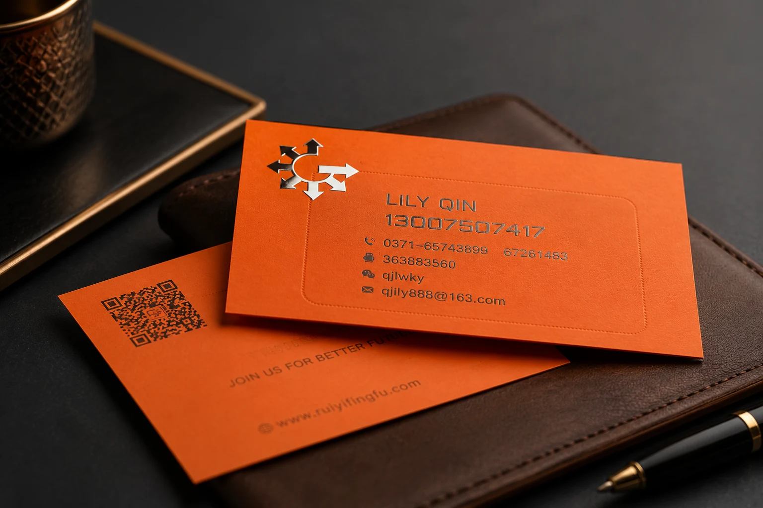
Soft touch works best when the card should feel calm, deliberate and premium without looking loud.
It is a good fit for:
- Brand consultants, designers, architects, agencies and creative studios.
- Real estate, hospitality, wellness and personal service brands.
- Dark or deep color cards that need a quiet matte surface.
- Minimal layouts where the surface and a small finish detail carry the design.
- Cards handed directly to clients, guests, buyers or partners.
The finish is strongest when the design gives it room. A simple layout, enough contrast, and one controlled accent often work better than crowding the card with several effects.
For broader material and finish options, compare the main custom business cards page.
When soft touch may be the wrong choice
Soft touch is not automatically better than matte, uncoated or gloss. It is better only when the surface matches how the card will be used.
Consider another direction if:
- People need to write notes on the card.
- The cards will be handled heavily or carried loosely.
- The design needs a strong glossy photo look.
- You want the texture of uncoated paper rather than a smooth laminated surface.
- The brand uses tiny text or low contrast colors.
- The project is mainly looking for the lowest possible cost.
For premium custom cards, the better question is not “Which finish is best?” It is “Which finish fits the actual use of this card?”
Do dark soft touch cards show fingerprints?
They can. Dark soft touch cards often show fingerprints, skin oils, dust or handling marks more clearly than lighter cards.
That does not mean dark soft touch is a bad idea. Black, navy, burgundy and deep green can look excellent with a soft matte surface. The point is to review the design under real handling conditions, not only under studio light.
To reduce risk:
- Keep contact details easy to read.
- Avoid using dark-on-dark effects for critical information.
- Use foil, white ink, debossing or spot UV as accents, not decoration everywhere.
- Check how the card looks after being touched.
- Ask for samples if the card will be used at events, meetings, hospitality desks or sales calls.
If dark-card readability is the main issue, ZIVFY’s black business cards guide is the more useful companion page.
Can you write on soft touch cards?
Soft touch is usually not the best surface for cards that need handwritten notes.
Some pens may write weakly, smear, or need more drying time. The result depends on the pen, ink, surface and how much pressure the person uses.
If writing matters, consider one of these options:
- Use an uncoated paper.
- Keep one side or one area more writing-friendly.
- Test the exact pen on a sample.
- Choose soft touch only if writing is not central to the card’s use.
This is one of the easiest places to make the wrong choice from photos. A card can look right and still fail the daily-use test.
Foil, spot UV, debossing and thickness on soft touch cards
Soft touch can work well with other finishes. The design just needs restraint.
Foil on soft touch
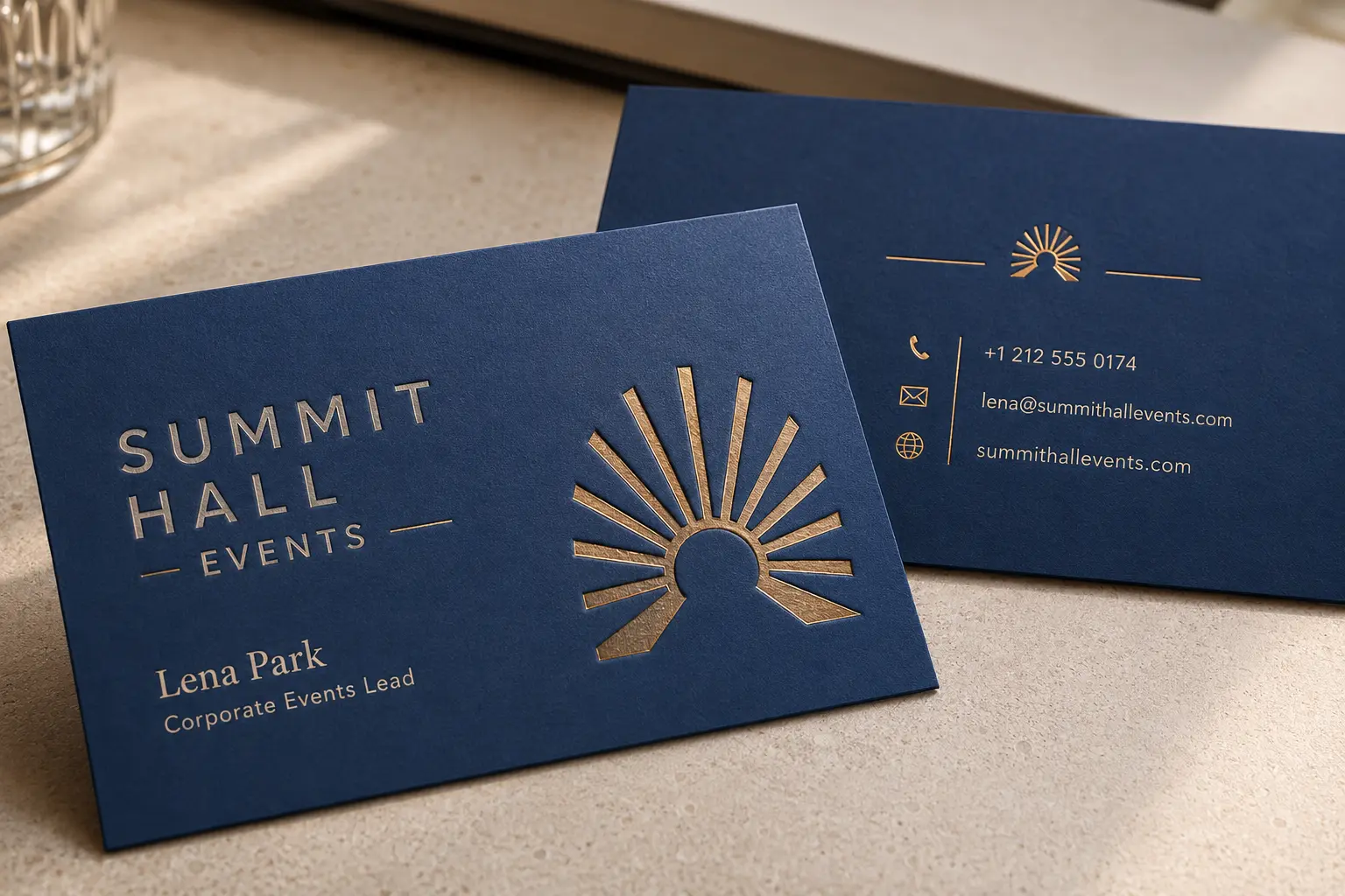
Foil can stand out sharply against a soft matte surface. It often works best for a logo, initials, a small border or a short accent. Too much foil can make the card feel busy and take attention away from the surface.
Spot UV on soft touch
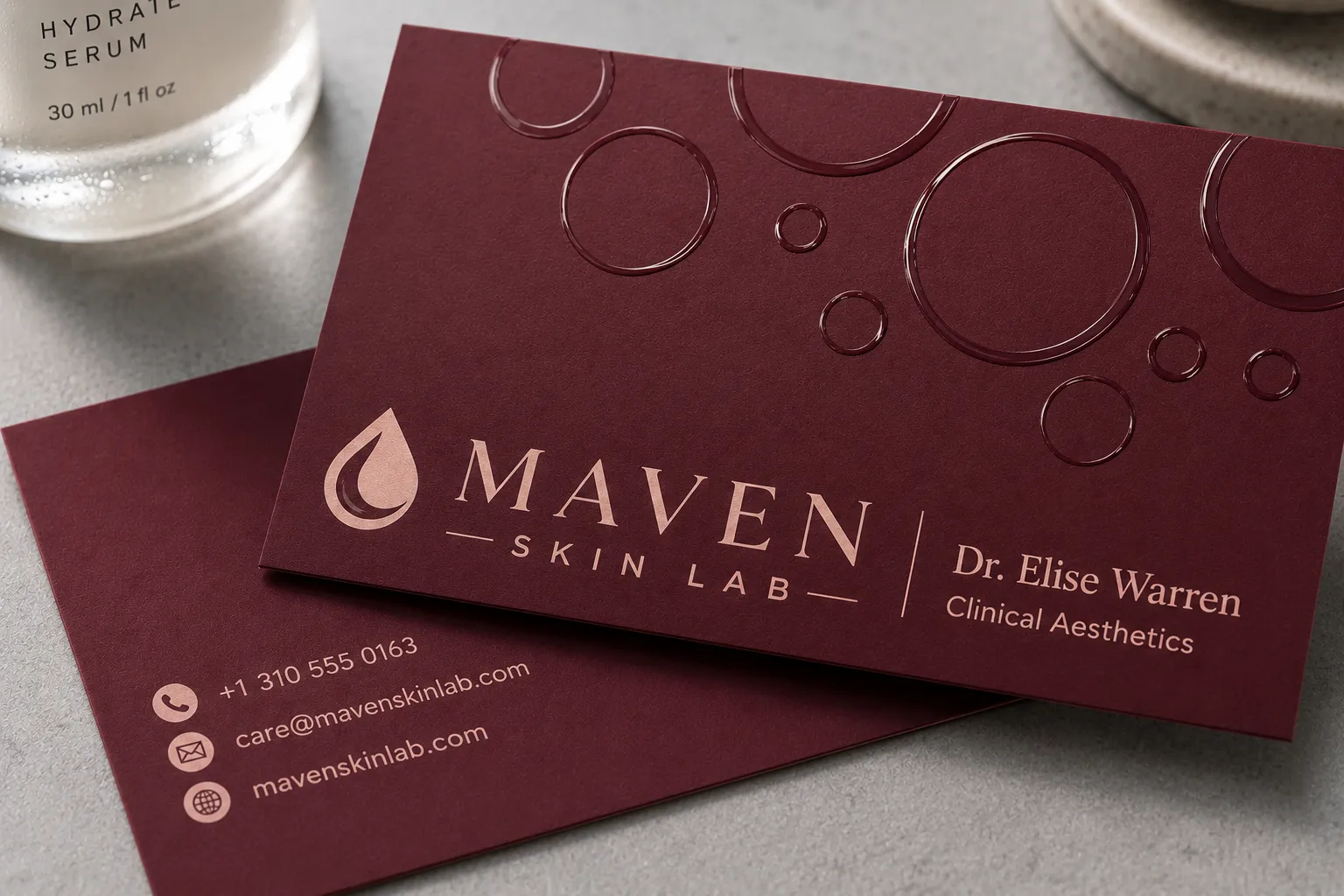
Spot UV adds a glossy contrast against the matte background. It can work for logos, patterns, icons or subtle texture effects. If that contrast is important, see ZIVFY’s spot UV business cards page.
Debossing or embossing on soft touch
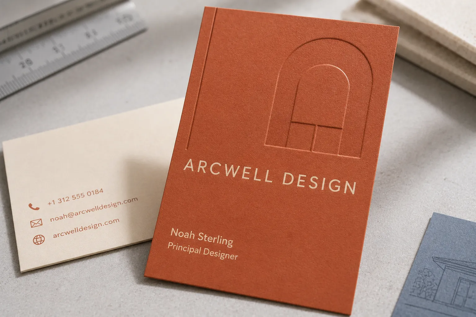
Blind debossing and embossing can make a soft touch card feel more tactile without adding shine. This is useful when the design should stay understated. For pressure-focused examples, see debossed business cards.
Thickness and structure
Soft touch changes the surface. Thickness changes the body of the card.
If the card needs to feel substantial, discuss both. A soft finish on a light stock may not give the same impression as a thicker or duplex card with the same surface.
Why photos are not enough
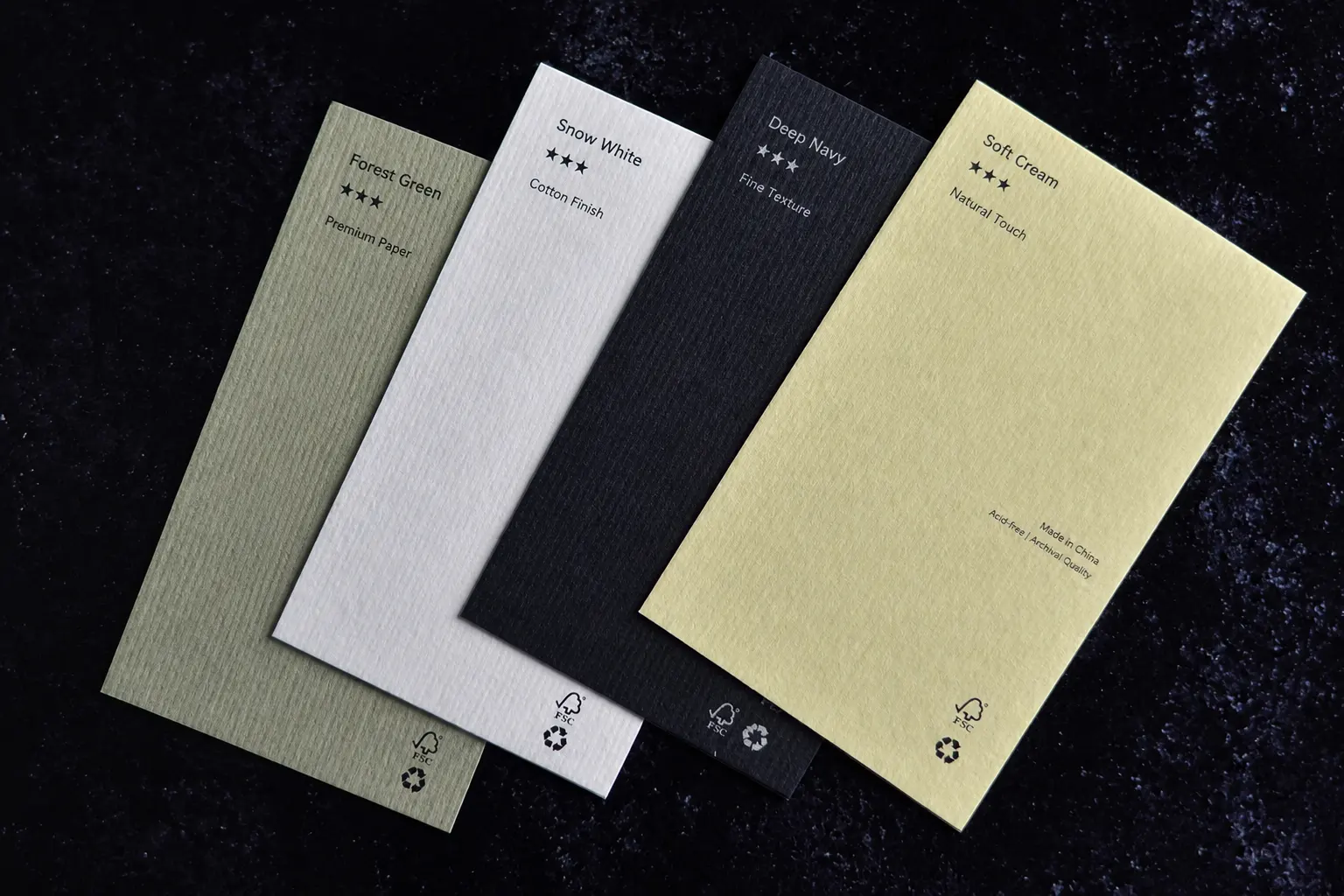
Photos help with layout, color direction and finish highlights. They do not tell you how the card feels.
They also do not reliably show:
- Whether dark colors mark easily.
- Whether the laminated surface feels too smooth for the way the card will be used.
- Whether the text is easy to read in normal light.
- Whether the card can be written on.
- Whether the thickness feels right for the brand.
- Whether foil, spot UV or debossing feels balanced.
This is where samples help. ZIVFY’s sample book lets you compare real material, thickness, surface, texture and finish directions. Samples are free; the customer pays shipping after the shipping cost is confirmed. Destination duties, taxes or customs fees are normally the customer’s responsibility.
The sample book cannot include every possible custom combination. It also does not replace proof review, artwork review or quote review. It is mainly for narrowing the material and finish direction before you commit.
What to send before requesting a quote
If you are ready for quote review, prepare the details that affect the final card:
- Artwork or a design reference.
- Quantity. ZIVFY’s public MOQ for custom business cards is 200 cards.
- Card size.
- Paper or thickness direction if known.
- Color direction, especially for dark cards.
- Finish direction, such as soft touch, foil, debossing, spot UV or edge color.
- Whether the card needs to be writable.
- Whether you need a sample book before confirming the material.
The clearer the starting point, the easier it is to decide whether soft touch is right or whether another surface would serve the project better.
Final recommendation
Choose soft touch when you want a smooth, low-glare business card with a more tactile feel than standard matte. It is a strong option for refined brand cards, dark surfaces, minimal layouts and finish combinations where touch matters.
Do not choose it only because the name sounds premium. Check the real card against your color, thickness, writing needs, handling conditions and finishing details.
If you are still comparing materials, request the ZIVFY business card sample book. If your design and quantity are already clear, review soft touch business cards and send your project details for quote review.
FAQ
Is soft touch the same as matte?
No. Soft touch usually has a matte look, but it feels smoother and more velvety than many regular matte finishes.
Is soft touch the same as velvet or suede business cards?
Sometimes the terms overlap, but they are not always identical across suppliers. Velvet and suede usually describe a very soft matte feel. Ask for samples if the exact surface matters.
Do soft touch cards show fingerprints?
They can, especially in dark colors such as black, navy, burgundy or deep green. Fingerprints and handling marks depend on the surface, lighting and how the card is used.
Can you write on soft touch business cards?
Soft touch is usually less writing-friendly than uncoated paper. Some pens may smear or dry slowly. If writing matters, test the pen on a sample or choose a more suitable writing area.
Can soft touch cards include foil, spot UV or debossing?
Yes, soft touch can be combined with foil, spot UV, debossing or embossing when the design is reviewed properly. These finishes usually work best as controlled accents.
Should I request a sample before ordering soft touch cards?
Request samples if hand feel, fingerprints, writing behavior, dark color readability, thickness or finish combinations matter to the project. Photos help with direction, but samples are better for judging the surface.