
For Metallic PET labels, choose matte silver for a muted technical look, brushed silver for a directional metal texture, brushed gold for a warmer premium surface, and bright gold for stronger reflection. Then check artwork contrast, white ink, label size, product surface, and application method. If screen images do not make the difference clear, review physical material samples before confirming the finish.
These Metallic PET label finishes set the visual direction. Artwork and application details still decide the production route.
What is a Metallic PET label?
On this page, Metallic PET means a flexible polyester label film whose silver or gold face creates the metallic background. It is not a rigid metal plate, and the terms "metallic label" and "foil label" can refer to other constructions. If you want the film itself to provide the silver or gold surface, start with custom Metallic PET labels. If you want a foil effect or metallic detail only in selected parts of the artwork, describe that result in the quote so the construction can be reviewed separately.
Compare the four Metallic PET label finishes
The four finishes differ mainly in reflection, color direction, and surface texture. Those visual differences matter, but they do not settle the adhesive, print, size, or application questions.
| Finish | What you see | Where it can fit | Artwork check | When samples help most |
|---|---|---|---|---|
| Matte Silver PET | A muted satin silver surface with less obvious reflection | Technical labels, model information, and clean industrial packaging | Check pale colors, small text, and any area that should remain clearly separated from the silver base | When the buyer needs to judge how quiet or reflective the silver looks in real light |
| Brushed Silver PET | A directional metal grain closer to a brushed steel look | Tools, equipment, electronics, and engineered product branding | Review how the grain sits behind logos, fine lines, and product information | When grain direction is a large part of the intended design |
| Brushed Gold PET | A warm gold surface with visible brushed texture | Cosmetics, candles, fragrance, and gift packaging | Check brand colors, white areas, and whether selected artwork needs white ink support | When screen images do not show the gold tone or texture clearly enough |
| Bright Gold PET | A more reflective gold surface with stronger light response | Logo marks, product seals, and bold retail details | Review black or white contrast, small details, and reflections around important information | When the label will be seen under changing retail or product lighting |
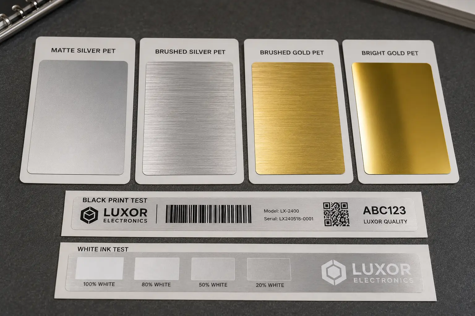
These are use directions, not fixed rules. A brushed gold label can work on technical packaging, and a matte silver label can suit cosmetics. The better test is whether the surface works with the product, the brand colors, and the information that must stay readable.
Reflection also changes with viewing angle. A finish that looks restrained in one product photo may look much brighter under direct lighting. If the finish itself is carrying much of the design, a real material reference is more useful than another screen mockup.
Should you choose silver or gold for your product?
Silver is usually the cooler or more technical direction, while gold is warmer and more decorative. The final choice should follow the product, brand colors, and desired reflection rather than a general rule about what looks more expensive.
Matte silver PET labels often suit electronics, equipment, tools, or model information because the quieter metal-like surface can sit comfortably beside dark housings and technical text. Brushed silver PET labels add directional grain. On a flat black electronics case, that grain may make a simple black logo feel built into the product.
Gold changes the mood, but the two gold finishes do not behave the same way. Brushed gold PET labels keep a visible directional texture and usually read as the quieter option. Bright gold PET labels respond more strongly to light, which can suit a product seal or a short logo mark. That stronger reflection may be less helpful when several lines of small information need a stable background.
Packaging examples can guide the first choice. They should not decide it. A candle jar may suit brushed gold, while a fragrance box may use bright gold only for a small emblem. A silver finish may work just as well for either product when the brand palette is cool or monochrome.
Compare the label against the real package color, not a white artboard. Dark products, pale cartons, glass, and colored plastic can make the same silver or gold surface look quite different.
How do artwork and white ink change the finish?
The silver or gold PET base can influence printed colors. White ink on Metallic PET labels can add opacity or color control where the metallic effect should be reduced.
Metallic PET is not a neutral white label stock. Uncovered areas keep the silver or gold material visible, and printed colors can be influenced by that base. This is useful when the design deliberately lets the metal surface show through a logo, border, or background field. It creates trouble when the artwork was prepared as if every white area would print automatically.
Black print often gives clear contrast on silver or gold PET, but important small text still needs review at the finished label size. Pale colors may lose separation from the metallic base. White artwork needs a defined white-ink layer if it is meant to appear white rather than remain unprinted. A selected white base can also support some colored areas while leaving other parts metallic.
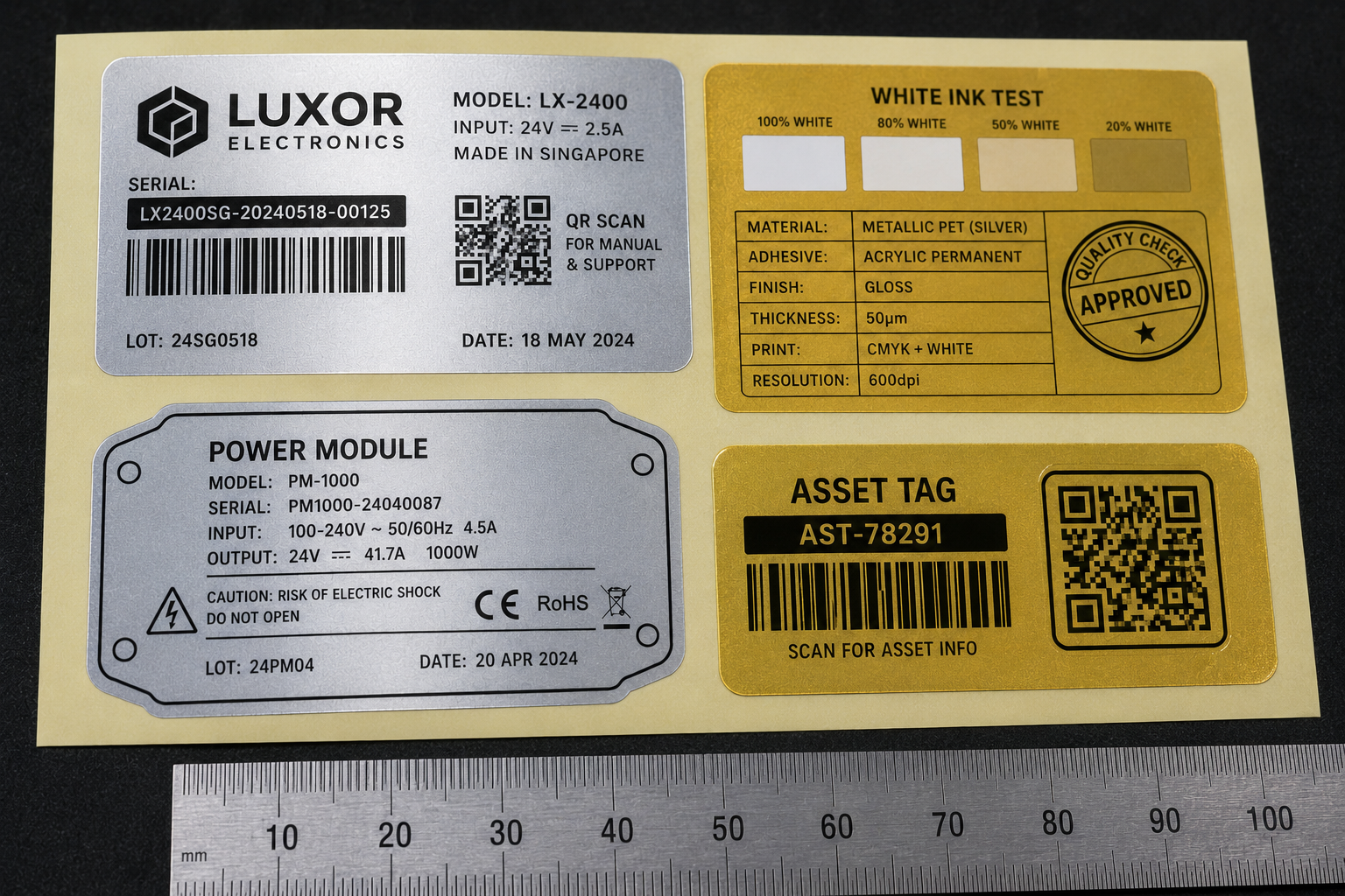
Barcodes and QR codes need their own check. The material, reflection, printed contrast, finished size, and scanning conditions can all affect the result, so the article should not promise readability from artwork alone. The same caution applies to fine warning text, ingredient information, and small model numbers.
Send the actual artwork before production review. If the white-ink areas or cut line are not prepared yet, use ZIVFY's Artwork Support guidance to organize the logo, text, dieline, product photo, and intended metallic areas.
What does the product surface change?
Finish is the visual choice. The product surface, curve, label size, adhesive, and application method determine whether the selected label direction can work in practice.
A flat electronics housing gives the label a broad, stable contact area. A curved bottle or cosmetic jar puts more pressure on the label edges, especially when the label is wide in relation to the container. The same brushed silver material may be straightforward on one surface and need a different size or adhesive review on the other.
Glass, plastic, coated packaging, painted equipment, and rubberized surfaces should be treated as review cases. Material names alone do not confirm adhesion. Surface energy, curve, storage, handling, and application method can change the production direction.
The use environment matters too, but it should be described precisely. PET film is not proof that every finished label is waterproof, outdoor rated, chemical resistant, scratchproof, or permanently bonded. Those claims depend on the complete construction and the real use conditions.
Send a product photo and identify the surface material if known. Include the approximate label position and dimensions. That information is usually more useful than asking for the "strongest" adhesive without describing the product.
When should you request Metallic PET material samples?
Request relevant label material samples when reflection, texture, or the gold-versus-silver tone cannot be judged reliably from screen images.
Samples help with the physical choices: how quiet Matte Silver PET looks, how visible the Brushed Silver PET grain is, and how Brushed Gold PET differs from Bright Gold PET under real light. Place the reference near the product or packaging when possible. A finish seen beside the actual brand colors is easier to judge than the same sample viewed on its own.
The available sample pack is matched to the project and may not contain every finish, adhesive, size, print setup, or supply format. It is a material and finish reference, not a custom proof of the final label. Artwork, surface, adhesive, and production details still need separate review.
Samples are free. The customer pays shipping after the shipping cost is confirmed, and destination duties, taxes, or customs fees are normally the customer's responsibility.
If the finish difference is hard to judge on screen, request relevant Metallic PET label material samples before confirming the surface direction.
What details should you send for review?
Send the preferred finish, product photo and surface, finished label size, artwork, quantity or roll count, application method, use environment, and supply-format needs.
A short project note is enough to start:
- Preferred first choice and second choice among Matte Silver PET, Brushed Silver PET, Brushed Gold PET, and Bright Gold PET
- Product photo, surface material if known, and the proposed label position
- Finished label width, height, shape, and any container curve
- Artwork, logo, text, barcode, QR code, or a rough layout
- Areas that should remain metallic and areas that may need white ink
- Quantity or roll count, plus roll, sheet, individual, kiss-cut, or die-cut supply needs
- Application method and use environment
These details allow the review to separate three decisions that are easy to mix together: the finish you want to see, the print setup the artwork needs, and the construction that suits the product.
If the project direction is already clear, review the available custom Metallic PET label options and send the project details through ZIVFY's general quote page. If the artwork is the uncertain part, prepare it for review first. If the finish is still uncertain, start with samples.