
This is a really common problem when you order printing. You send over a colorful design, but why does it come back dark, dull and flat?
Then the print shop tells you, “It’s because we print in CMYK, but your file is RGB or uses spot colors.” You’re left scratching your head, with no idea what’s going on. Today, we don’t need a lot of technical terms. Let’s use simple comparisons to explain what’s happening and what you can do about it.
First, What Are Pantone and CMYK?
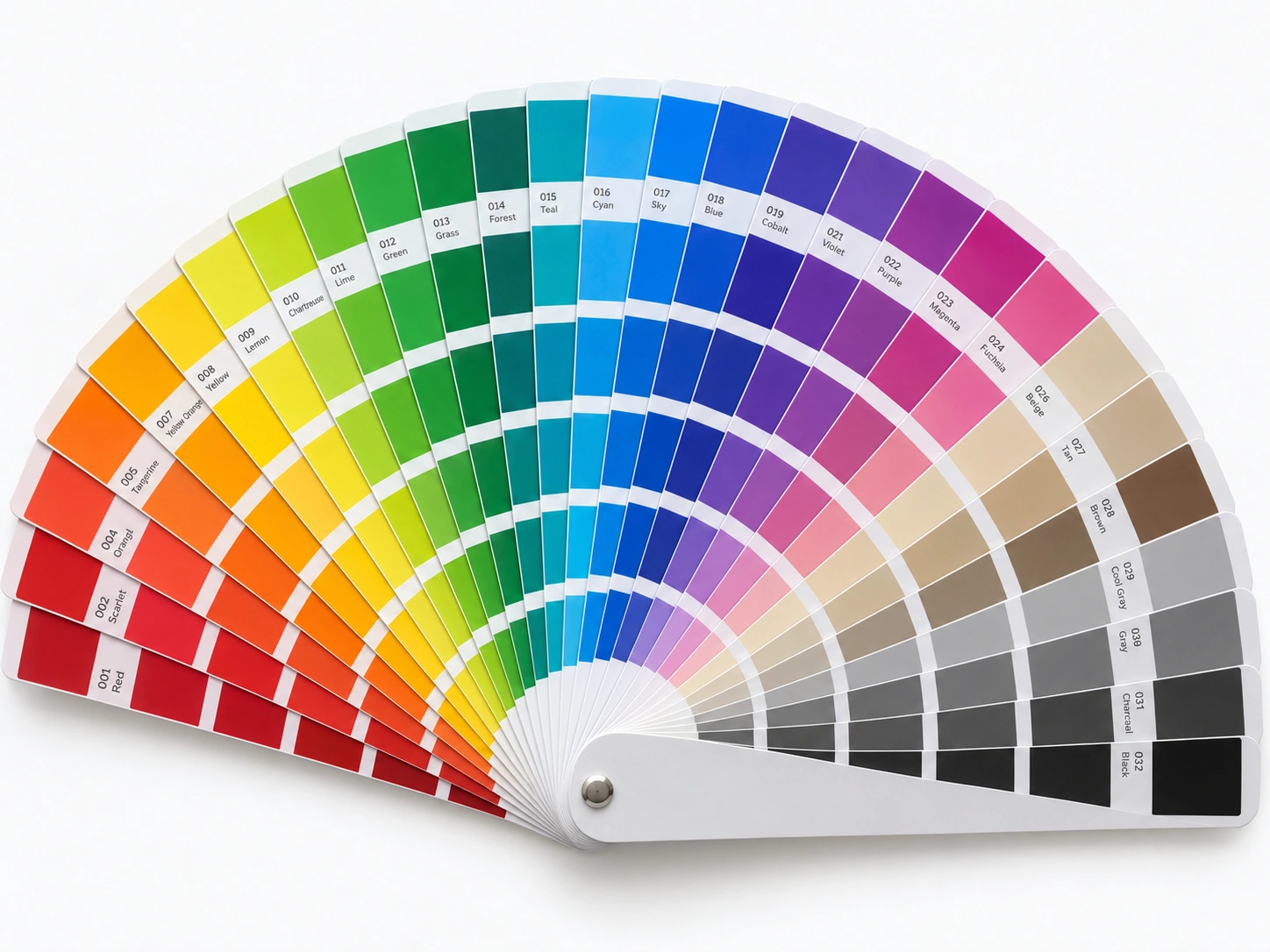
Think of Pantone as a color swatch book. Every color has a number, so when you give someone that number, you both know which color you’re talking about. A lot of the time, a brand’s official colors are defined by Pantone numbers.
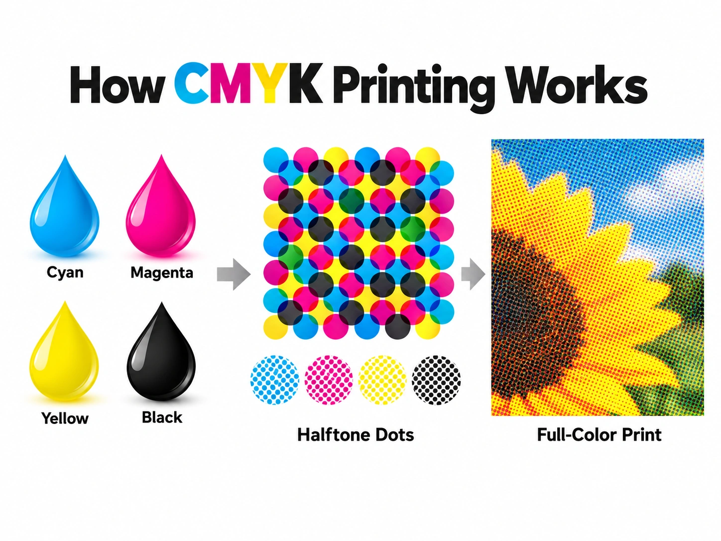
CMYK is the four basic ink colors most printing uses: cyan, magenta, yellow and black. The press layers these four colors to make all kinds of other colors, a bit like mixing watercolors when you were a kid.
So Pantone tells us “which color you want,” while CMYK tells us “how to print that color.” They’re not the same thing, and you don’t have to pick one or the other.
Separate Spot Ink vs. Mixing from Four Colors: What’s the Difference?
There are basically two ways to print the same color.
The first is mixing a separate ink, which is what we use in spot color printing. We mix a batch of ink specifically for that color and use it to print that color. The upside is that the color is fairly consistent and comes out about the same each time. But when you have more colors, the print shop needs to prepare more inks and adjust the press accordingly. That usually means more setup work and higher costs. It doesn’t mean the paper has to go through the press again for every extra color.
The second is mixing the color from the basic inks, also called process color simulation. One set of inks can print the whole design, so photos, gradients and brand colors can all print together. But four colors can only reproduce a certain range. Some colors will be a little off, and you won’t get an exact match to the swatch.
Neither one is better than the other. It depends on how much the color matters to you.
What If My Design Has Several Brand Colors, Plus Photos and Gradients?
Full-color photos usually need several colors mixed together. Spot inks can print gradients too, but with traditional spot color printing, you need a printing plate that uses tiny dots to create the gradient. Making the plate and getting everything ready adds to the cost.
So when a design has several brand colors that each need their own ink, plus photos that need the basic process inks, the print shop has to arrange all of that together. There’s more preparation involved.
If only one or two colors absolutely have to match, pick those out. That makes the rest much easier.
Now you might be wondering, “Why not just print the spot colors or RGB colors? Why explain all this to me?” You don’t need to understand all the complicated parts. You just need to know that spot color printing usually means large quantities, high costs and more demands on a traditional press. Just getting that kind of press set up can cost quite a bit. If you only need a small quantity, you can pretty much say goodbye to spot colors.
So what’s the solution? You want vivid colors and the look of several spot colors, but you only need a few dozen pieces, or even just a handful. Of course, we have a way to do that.
What Is Seven-Color Extended Gamut Printing?
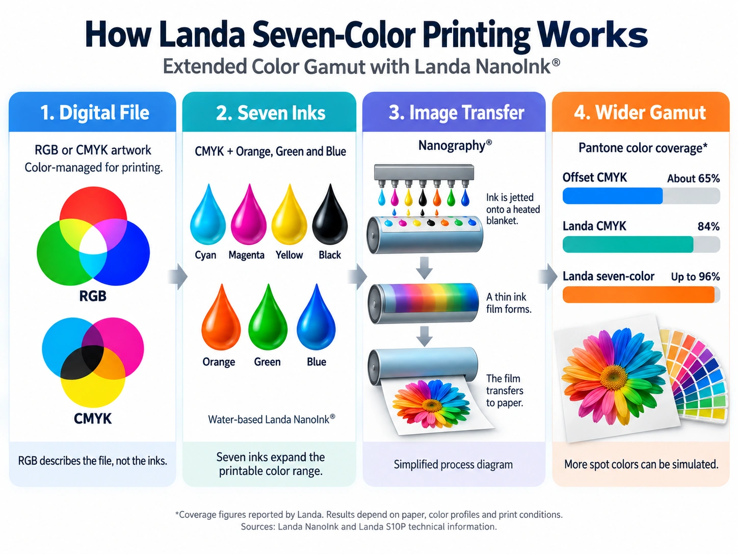
We use a Landa seven-color press. Simply put, it takes the regular four colors and adds three more. With more colors, the range it can reproduce gets much wider. According to Landa, this seven-color process can cover up to 96% of Pantone spot colors, so it should meet most of your color requirements.
What this means for you: no matter how many Pantone references are in your design, we can generally print them all together without mixing a separate ink for each color. Photos, gradients and brand colors can all go on the same sheet and print together.
Of course, 96% isn’t 100%, so there are two things we should be upfront about.
First, some colors may still look different, and not every color will be an exact match. If there’s a color you really care about, send us the color number. We’ll check it first and, if necessary, print a sample so you can compare.
Second, our Landa seven-color process can’t produce special effects such as true metallic or fluorescent colors. Those effects need dedicated metallic or fluorescent inks. They’re not something we can produce just by mixing the seven inks we already use.
To see how to send us your brand colors and what to expect from Pantone color matching, take a look at our brand color sample page.
Read more about what RGB printing can do for your colors.
What Format Should My Artwork Be In?
Our first recommendation is an RGB design file. If the file contains spot colors, keep those in it too. This gives us the best chance of reproducing as much of your intended color range as possible.
You can send a CMYK file too. But if the vivid colors you wanted to keep were already lost during conversion, that defeats the point of using this press to reproduce those colors.
If you only have a CMYK file, you can still send it to us. Just remember that changing it back to RGB won’t bring back the original colors, so you may need to redo the artwork. Otherwise, you’re only changing the file back to RGB—the colors in it are still the ones from the CMYK file.
How Should I Set Up My Design File?
At Zivfy, we’ve always believed you shouldn’t waste your time on things you’re not good at. So just send us your design file. We’ll review it, adjust anything that could affect the printing process, and send it back for you to confirm.
What If I Only Have a Photo, and No Design File?
Tell us your idea, the size and what you’re making, and we’ll design it for you. There’s a design fee, and we’ll keep working on it until you’re happy!
A Few Other Things to Keep in Mind
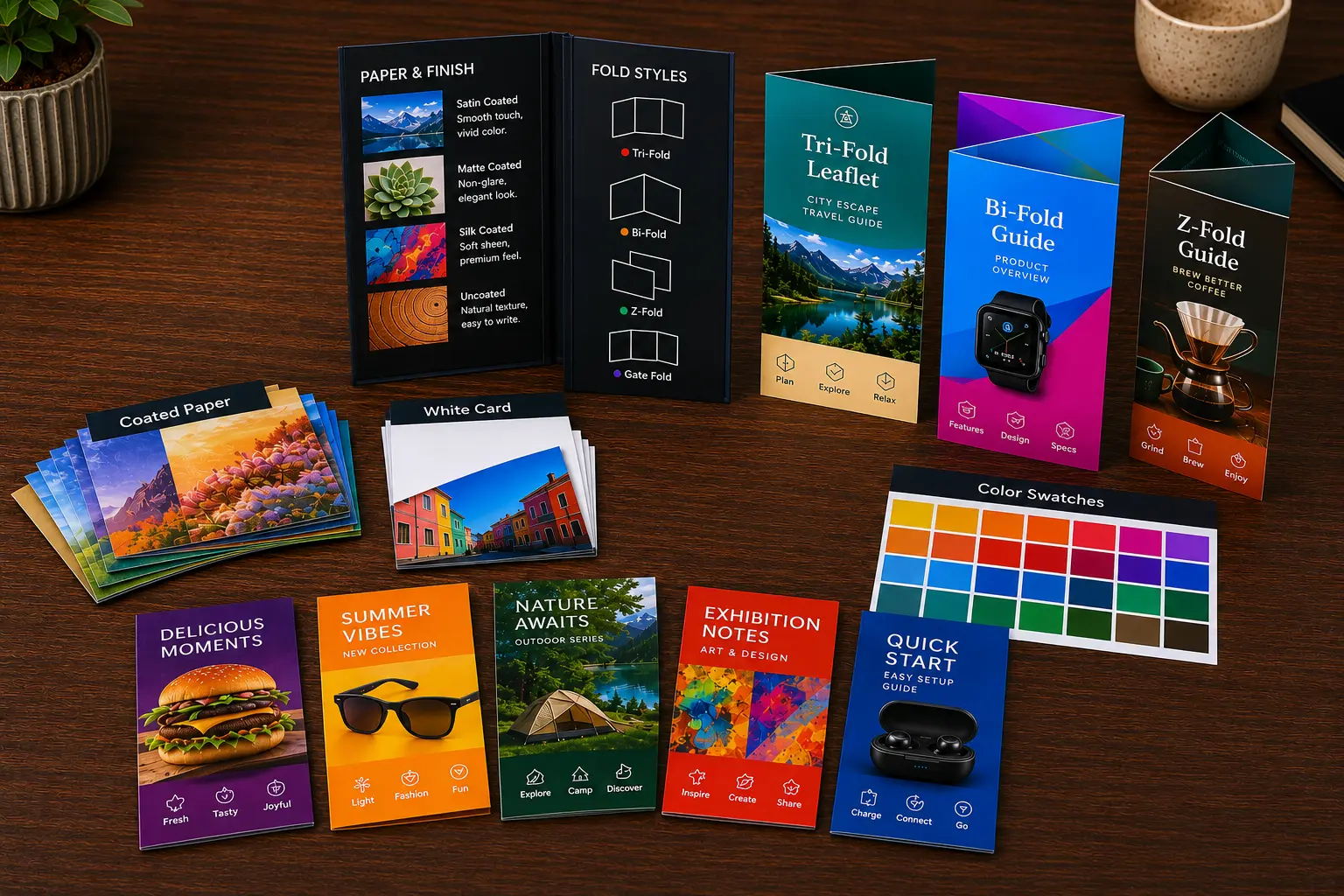
The Landa seven-color wide-gamut printing we use is, strictly speaking, digital printing. To keep the colors accurate, we only offer the two materials that work best for color: coated paper and white cardstock.
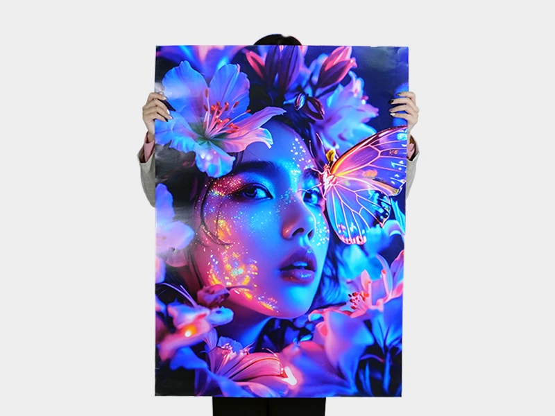
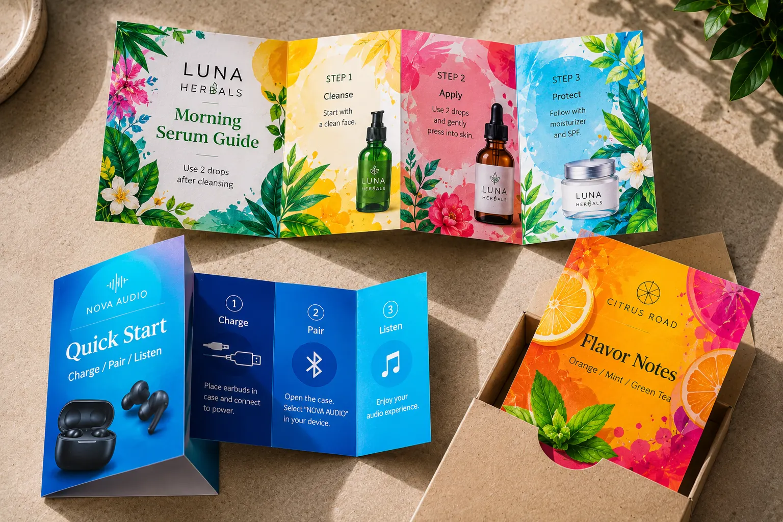
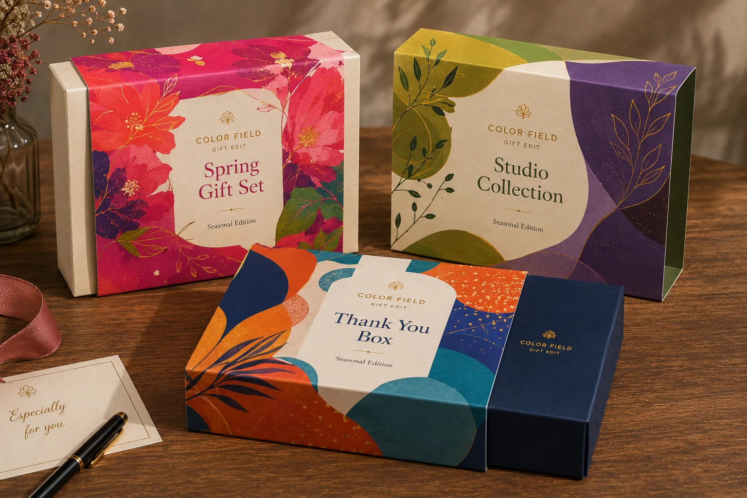
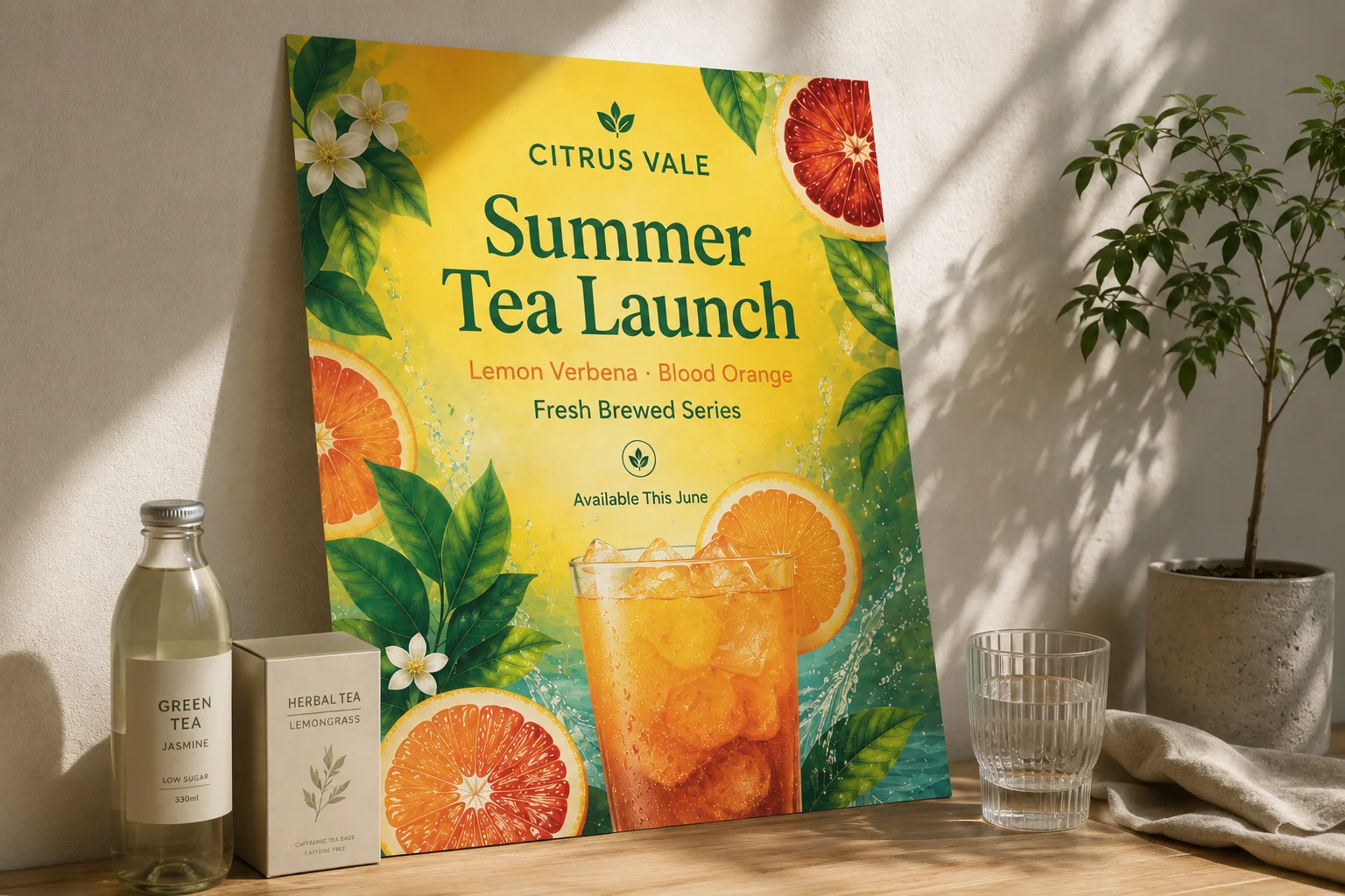
These are also two of the most widely used materials. Products like business cards, posters, stickers, paper boxes, folded leaflets and flyers are basically made from one or the other.
About Samples
Our minimum order is 10 pieces, which is pretty much the same as ordering a sample. So to test it first, we suggest simply ordering 10.
To Sum Up
Pantone just tells us which color you want. It doesn’t mean you need a separate spot ink.
For small runs with multiple brand colors, photos and gradients, seven-color extended gamut printing can generally print everything together.
Not sure? Send us your artwork and the color numbers. We’ll take a look first, and then you can decide whether to go ahead.