
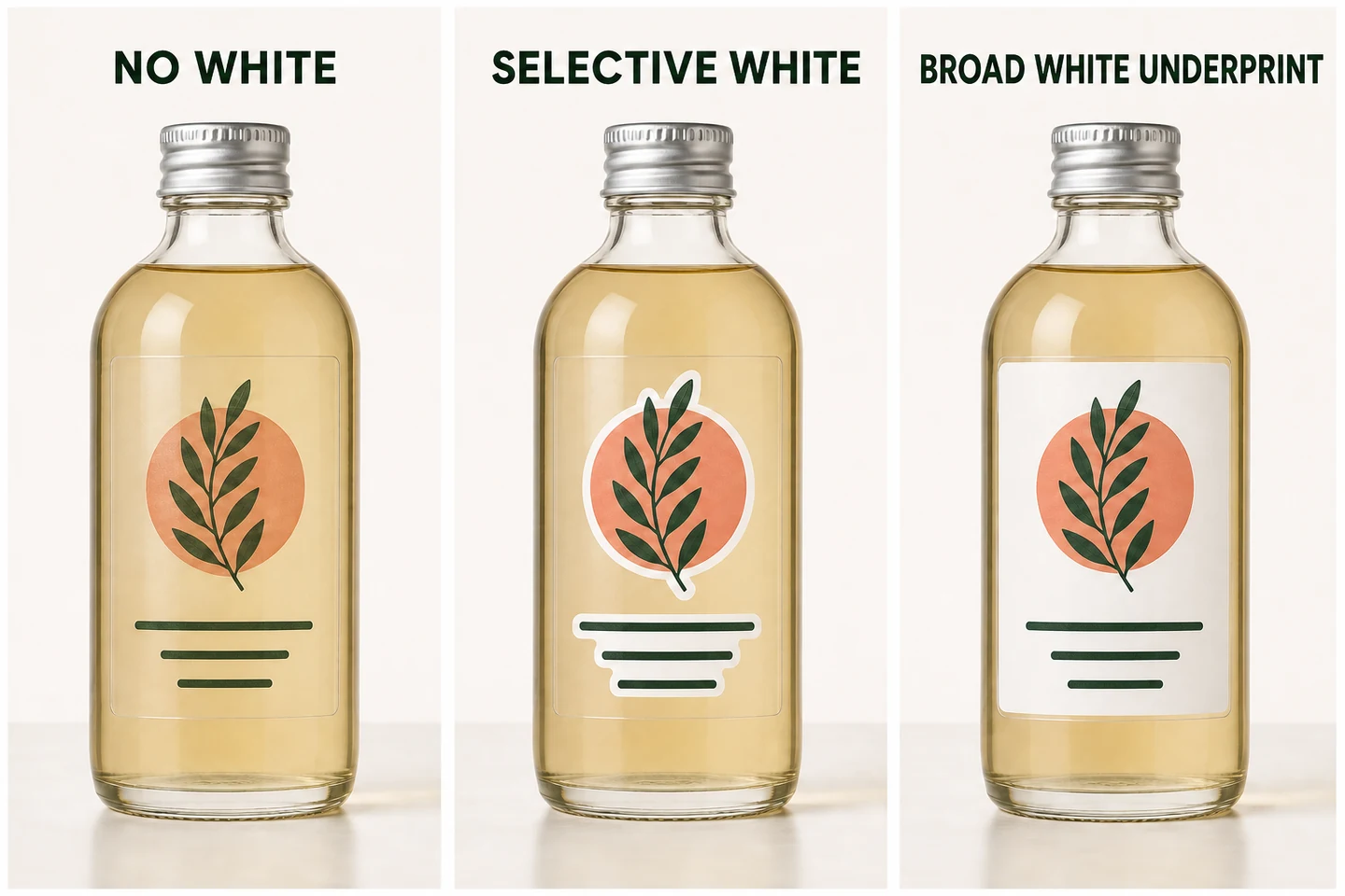
White ink on clear labels controls which parts of the artwork look opaque and which parts remain influenced by the package behind them. With no white layer, the bottle, jar, contents, or background can show through the printed colors. Selective white can support text, logos, and pale colors while preserving clear windows. A broader white underprint can make most printed colors look denser, but it only earns its place when the design still uses clear windows or transparent borders.
The choice comes down to transparency versus visibility. Make it on the actual bottle or jar, not on a white artboard. Artwork that reads clearly on screen can change on clear glass, an amber bottle, or a jar filled with a dark product.
What white ink changes on a clear label
Clear film has no built-in white background. Colored artwork printed without white support can remain partly transparent, so the bottle or product color becomes part of what the eye sees. Pale colors may lose contrast, and small details can become harder to read.
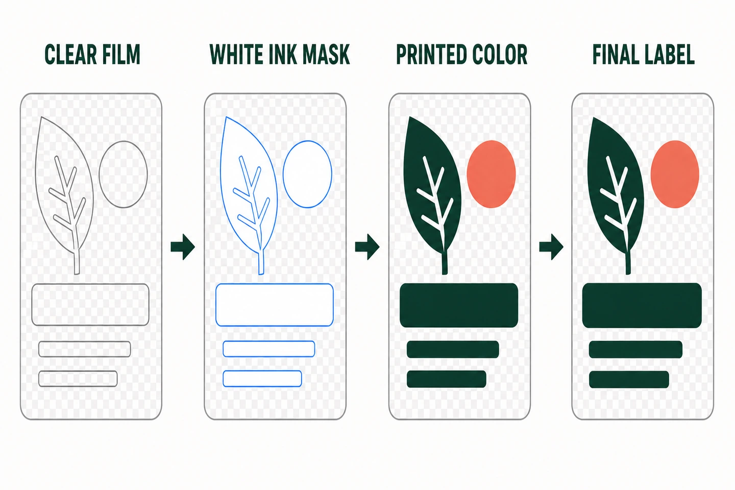
A white underprint provides a lighter base behind chosen parts of the design. It can sit behind a logo, fine text, a pale illustration, or most of the printed artwork. Areas excluded from that white layer can stay transparent.
Start by marking what a customer must be able to read, then decide where the package should show through. ZIVFY can review those choices for custom clear labels with white ink when the artwork and container details are available.
Choose one of four artwork routes
| Route | What stays transparent | When it fits | Main check before production |
|---|---|---|---|
| No white layer | Unprinted film stays clear, and printed colors remain influenced by the surface behind them. | The show-through is intentional and the artwork relies on visible darker elements. | Check readability on the real bottle or jar color. |
| Selective white | Clear windows and areas outside the white-ink mask remain transparent. | Text, logos, or pale colors need support while the no-label look remains important. | Define the white areas and confirm that intended windows remain clear. |
| Broad white underprint | Only deliberately excluded window areas remain transparent. | Most printed colors need a denser base, but selected transparent areas still matter. | If no useful transparent area remains, compare white PP instead of covering the full clear film with white ink. |
| White PP label | The main label field is not transparent. | Consistent coverage and readability matter more than seeing the container through the label. | Confirm that changing from clear film to an opaque white material is acceptable. |
No white layer
Skipping white ink keeps the strongest connection between the artwork and the package. It works when transparency is intentional and the key marks have enough contrast on the expected background.
Remember that white objects in a normal screen preview do not automatically become white ink on clear film. If white is not assigned as a printed layer, those areas may remain transparent. This matters for white logos, reversed text, and pale details.
Selective white behind important details
Selective white supports only the parts that need it. A logo can have a white base while the space around it remains clear. Fine text, ingredient information, or a pale graphic can receive the same treatment without turning the whole label opaque.
Production artwork needs a white-ink mask that identifies these areas. Before that file is prepared, answer a simpler question: which elements must stay readable regardless of what is visible through the bottle?
Broad white underprint behind most artwork
Use a broader white base when most printed colors need more density. Selected windows can stay clear, but the rest of the printed field will behave more like artwork placed on a light background.
This route often reduces the no-label effect, so check the balance before committing to it. If nearly the entire design needs a white base and there is no useful clear window or transparent border, compare a white PP synthetic label instead. Printing white across clear film just to recreate an opaque white field usually removes the reason for choosing clear film.
White PP label when consistency matters more
A white PP label removes most background influence from the main label field. Consider it when important information must remain easy to read across containers with different colors or contents and the design does not need a clear window or transparent border.
It also changes the visual idea. The package will no longer show through the main label area. If that tradeoff is acceptable, compare label material directions before finalizing the artwork.
Check the bottle or jar behind the label
The container is part of a clear-label design. Its color, contents, surface, and shape can all affect the apparent result.
A clear bottle filled with a pale liquid may give dark artwork enough contrast. Put the same artwork on an amber bottle or over a dark product and fine details can disappear. A transparent bottle may also reveal the shelf, hand, or background behind it, so the label can look different as the package moves.
Curves matter too. A label wrapping around a narrow bottle can move part of the artwork away from the front viewing area. Reflections on glass or glossy plastic may cross small text. The label size, shape, placement, and intended clear windows should be reviewed with the container rather than as a flat file alone.
For a useful review, provide a photo of the actual bottle or jar. Include the container material and color, plus the product or liquid color if it will be visible. A photo of the filled package is more informative than judging the design against a white artboard.
Catch readability problems before production
Check the design as a packaging reader will see it, rather than only as an artwork file.
- Look at small text and pale colors against the lightest and darkest expected backgrounds.
- Identify the logo, product name, required information, barcode, or QR code that must remain clear.
- Mark every area intended to stay transparent.
- Confirm where white ink is visible by itself and where it sits behind color.
- View the design at the intended label size and front-facing position.
- Check whether a curve, seam, reflection, or product fill line crosses important information.
Transparent film exposes the artwork to more background variation than an opaque label. Artwork review and samples can reduce uncertainty, but they cannot promise identical color, opacity, or contrast on every container, fill color, surface, and lighting condition. If the package will vary across products, include those variants in the review.
What to send for a ZIVFY clear-label review
You do not need a finished print file to start. A rough layout can be reviewed if it includes enough project information.
- Artwork, logo files, or a rough layout
- A photo of the bottle or jar, including its material and color
- The product or liquid color when it is visible through the container
- Label size, shape, placement, and the main viewing area
- A clear note showing which areas should stay transparent
- A note showing which text, logos, or color areas should receive white ink
- Quantity or roll count, plus the preferred roll, sheet, or individual format
- The use environment when moisture, refrigeration, repeated handling, or a curved surface matters
These details allow the review to focus on the real decision: whether the artwork needs no white, selective white, a broad white underprint with meaningful clear areas, or a white PP material direction.
When samples help, and what they cannot confirm
Samples help when the material direction is still uncertain. Use them to compare film clarity, visible label edges, white-ink support, print contrast, and appearance on a representative surface. Whenever possible, place the sample on a bottle or jar close to the final container color.
Available samples do not represent every final size, shape, adhesive, print color, white-ink mask, or production combination. They are a decision reference, not a custom proof of the finished label. You can review clear-label material samples before moving to artwork and quote review.
Request a clear-label artwork review
If you already have artwork, send it with the bottle or jar details, intended transparent areas, white-ink direction, label size, and quantity. ZIVFY can then review the most suitable clear-label route and the information needed for a custom quote.
Request a custom Clear Labels artwork review. If the material or finish direction is still uncertain, use the sample path first and compare the available references on a representative container.