
Customers who come to us for triple layer business cards usually have very specific ideas: one spot color printed across the whole front, another across the whole back, and a shape on the front that reveals the middle layer. They talk about spot colors and engraving, but very few stop to ask one question first: what will the edge look like?
The edge is the easiest part of a layered card to overlook, and the part where you can make the biggest difference. Many people assume layered business cards always look the same: white on the top and bottom, with a stripe of color in the middle. At ZIVFY, our layered cards don't come in fixed styles. You choose the color and paper for the front, the core and the back. The colors along the edge are up to you, too.
Why Do Most Layered Business Cards Look the Same?
Say you run a coffee roastery, and your brand colors are navy and coffee brown. You want a three-layer card with a navy face and a coffee-brown line around the edge. On the front, you'd like an engraved coffee cup, with the coffee pouring into it showing the brown of the middle layer.
Search online and you'll find that most options look alike. The two outer layers are white card, and the only thing you can choose is the middle layer, usually from around eight to sixteen colors. Even if you find a coffee brown, you'll get a white face with a white, brown, white edge. Where did the navy go? It can only be printed on the surface of the white card. And engraving to reveal the core usually isn't one of the options on the page.
Put simply, these are closer to ready-made products: the paper is fixed, and so is the process. Swapping the outer layers for a different paper, or printing solid spot colors on both sides, often goes beyond what you can select online.
Our color core business cards take a different approach: you choose all three layers.
The Edge Shows the Color of the Paper, Not the Ink
So why not just print solid navy on white card? From the front, it does look navy. But ink only sits on the surface. Once the card is cut, the edge shows the paper underneath: white, brown, white. The navy, brown, navy edge you wanted turns into a navy card with a white edge.
For a navy edge, the outer layers have to be navy paper. Colored paper like this is dyed all the way through, so the color runs right to the core and the cut edge matches the surface.
The same goes for cards with solid spot colors on both sides. However good the spot colors look, they only sit on the surface. If the outer layers are white paper, the edge will still be white. (We shared a similar two-sided spot color project in our duplex vs triplex comparison.) For a card like this, you need to decide early: accept the white lines, add painted edges, or use colored paper close to your spot colors for the outer layers.
So when you design a layered card, remember this: the edge shows three sheets of paper stacked together. If you want a particular edge, start with the paper.
How to Combine the Three Layers
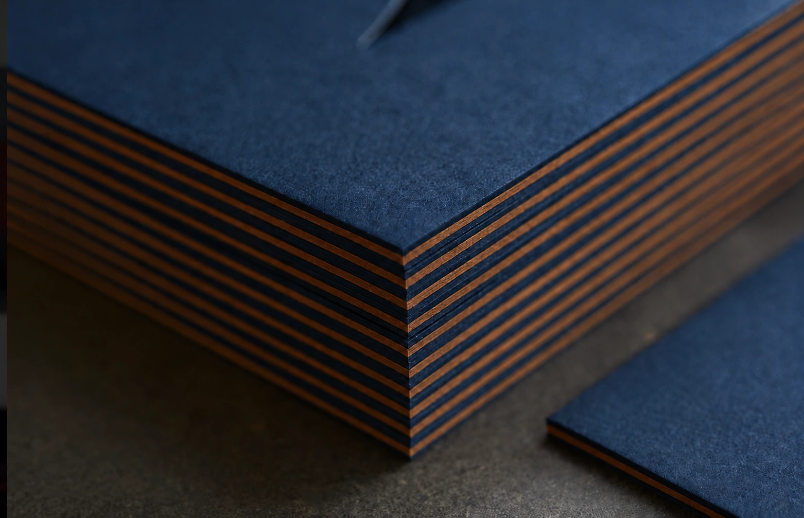
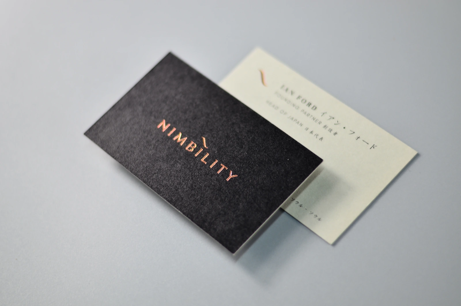
Back to the coffee roastery. Navy paper for the outer layers and coffee-brown paper for the core gives you a navy, brown, navy edge. Then the coffee cup is engraved on the front, and the coffee pouring into it shows the color of the core. Nothing extra needs to be printed: the line along the edge and the coffee in the cup come from the same sheet of brown paper. That's one approach, but not the only one.
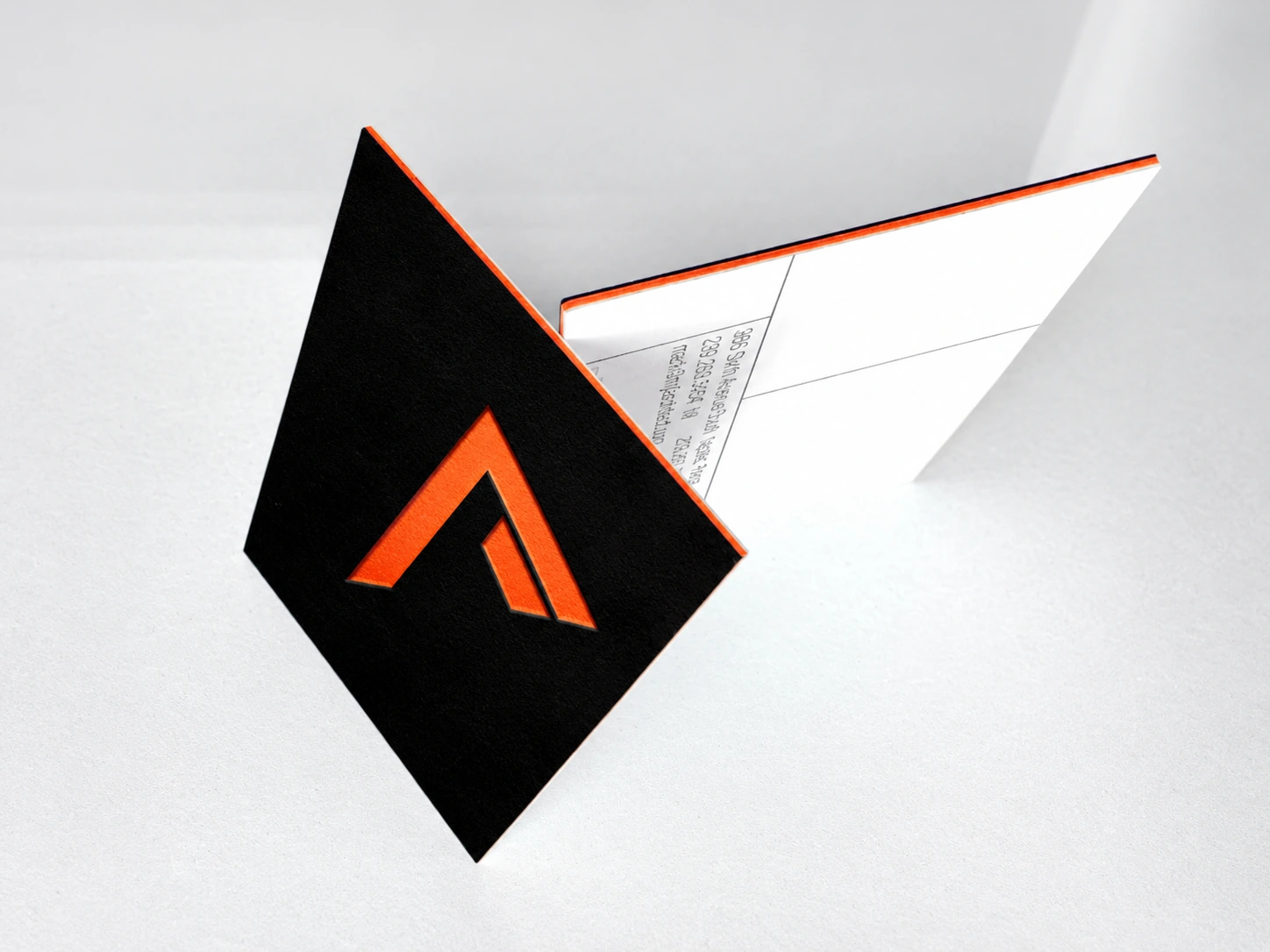
Matching outer layers with a contrasting core. Blue, orange, blue or black, orange, black fall into this group. The front and back match, and a bright line runs through the middle of the edge. Using your main brand color for the outer layers and an accent color for the core works naturally.
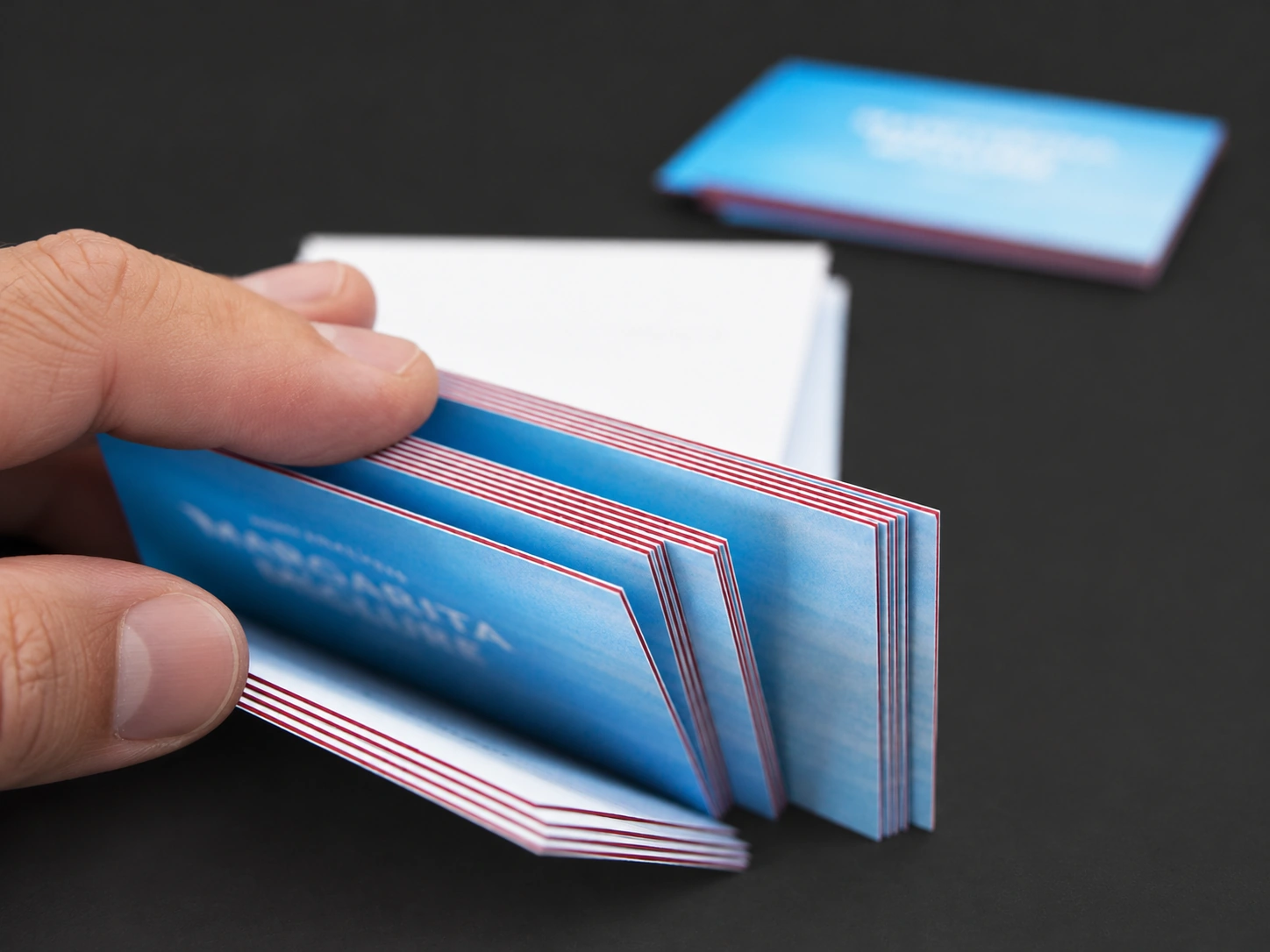
One dark, one light. White, black, white keeps the outer layers quiet and lets the black core do the work. The reverse looks good too: red, white, red puts a white core between dark outer layers, so the edge looks as if it's been outlined in white.
Different colors on the front and back. The front and back don't have to match. The coffee roastery could use navy on the front and an off-white back, which makes contact details easy to print, with coffee brown in the middle. The edge then shows three colors stacked together.
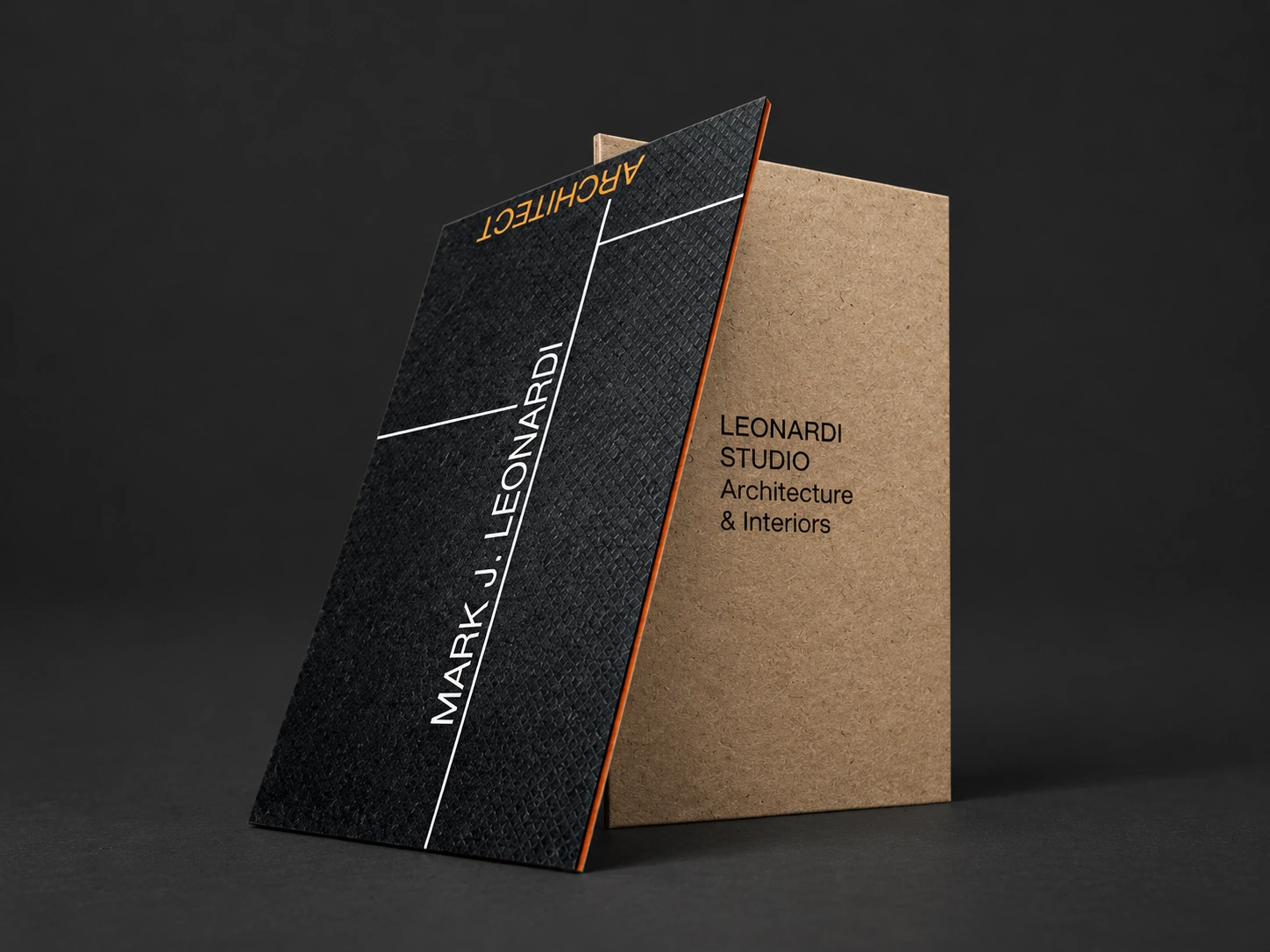
Textured paper for the outer layers. The outer layers can also be textured papers such as kraft or fiber paper. Kraft outer layers would give the coffee roastery's card a more handmade feel. Papers with very deep texture can risk the layers separating, though. Our guide to ordering color core business cards covers this in more detail.
Still not sure whether three layers or two suit you better? Take a look at the duplex vs triplex comparison mentioned above.
What If You Can't Find Paper in the Color You Want?
If your navy is an unusual shade and no colored paper comes close, there's another option: painted edges.
Painted edges add color to all four edges after the cards are cut. They can also fix the white edge problem mentioned above: paint the edges navy, and the whole card looks navy.
Painting the whole edge navy will also cover the separate layer colors. You'll get a single-color edge, rather than navy, brown, navy stripes. If you want those three lines to stay visible, we'll need to plan the paper colors for all three layers.
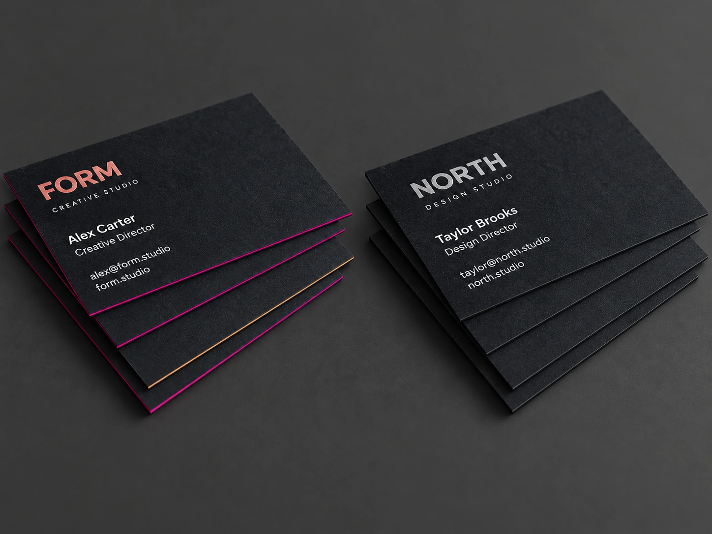
Keep in mind that painted edges can only get close to the color you want. We can't guarantee an exact match to your brand color. If color accuracy matters a lot, tell us first, and we'll work out which paper and method gets closest.
Should the Color Stripe on the Edge Be Thin or Thick?
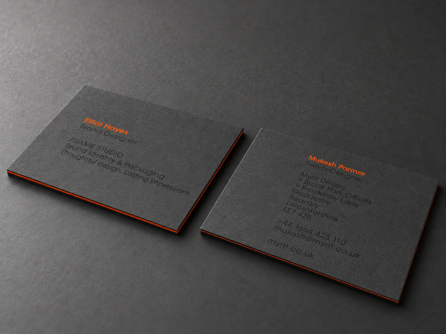
The same navy, brown, navy card can look very different depending on the stripe. A fine brown line is understated, like the piping on a tailored jacket. A wide band of brown stands out the moment the card comes out.
This is something you can choose, too. The width of each color depends on how thick each layer is. For a fine line, use thicker outer layers and a thinner core. For a wider band, make the core thicker. We stock a wide range of papers, often with several thicknesses in the same color, so we can usually match the stripe you have in mind. For the overall card thickness, see our business card thickness and size guide.
Will Flood-Printed Color Chip When the Cards Are Cut?
The coffee roastery wants navy to cover the whole face, with no white border at all. Some printers will advise against this. Layered cards are thick, they say, so a flood print that runs to the edge can chip or turn white when the cards are cut, and some require lamination.
This problem usually comes down to the blade. A layered card is bonded first, then cut out with a cutting die. If the blade isn't sharp enough, cutting through a card this thick can lift the ink along the edge.
Our cutting dies are made with blades imported from Japan, and they cut very cleanly, so a flood print that runs to the edge doesn't chip. We also inspect every card after cutting and replace any with defects. If you want color all the way to the edge, go for it.
Where to Start With Your Own Layered Card
The kind of request described at the start isn't unusual for us at all. Most people who come to us for layered cards have ideas of their own: solid spot colors on both sides, a different color revealed from the core, an edge that looks a certain way. If you can't find your idea among the options elsewhere, that's a good reason to talk to us.
You don't need to know paper names or thicknesses first. Just tell us three things: what color you want on the front, what color on the back, and what you'd like to see along the edge. If you have a logo, brand colors or a reference image, send those too.
We'll find suitable papers, check whether painted edges can fill any color gaps, and work out the thickness of each layer. If you'd like to feel the papers first, you can request print samples. When you're ready, send your idea through our quote request page.